

The importance of visuals in customer experience
TL;DR:
- Visual design most impacts customer experience and builds trust even before content evaluation. It immediately directs attention, emotions, and purchasing decisions, especially in the hospitality industry and marketing. Consistent, strategic visual communication increases credibility, engagement, and conversions.
Visuals are the quickest influencer of customer experience: they build trust or distrust before a customer has read a single word. Visual communication encompasses typography, colors, layout, signage, and spatial design as a whole, and each of these elements guides the customer's attention, emotional experience, and purchasing decision. This article examines research and practical examples of how visual design builds brand credibility, guides behavior, and deepens customer relationships, particularly in the hospitality industry and marketing.
The Importance of Visuals in Customer Experience: Trust at First Sight
Visual design determines trust in 46.1 percent of cases before content or functionality. This finding from the Stanford Web Credibility Project, involving 2,684 participants, practically means that a customer assesses your company's professionalism based on its visual appearance even before reading any product description or price. Visual design serves as proof of professionalism even before content evaluation.
This phenomenon is called the Aesthetic-Usability Effect: a visually pleasing interface or space is also perceived as functionally better, even if it technically isn't. In restaurants, this means that refined decor, a consistent color scheme, and clear signage increase overall customer satisfaction even before tasting the food. For marketers, it means that the visual quality of a landing page affects conversion more than the content of the text.
The three key elements of visual balance are:
- Typography: Font choices communicate the brand's personality and make reading easier or more difficult. Serif fonts are associated with tradition and reliability, sans-serif with modern clarity.
- Colors: A color palette evokes emotions and directs attention to specific elements. In a restaurant, warm lighting and earthy tones create a sense of security.
- Layout and hierarchy: The arrangement of elements tells the customer where to look first and what is considered most important.
“Visual design is not decoration. It is communication that happens before words.” This applies equally to websites, restaurants, and exhibition stands.
Customer-centric design starts with every visual choice being made from the customer's perspective, not the designer's aesthetic preferences. When typography, colors, and layout consistently support each other, an experience is created that feels professional and trustworthy.
How Visual Elements Guide Attention and Purchase Intentions
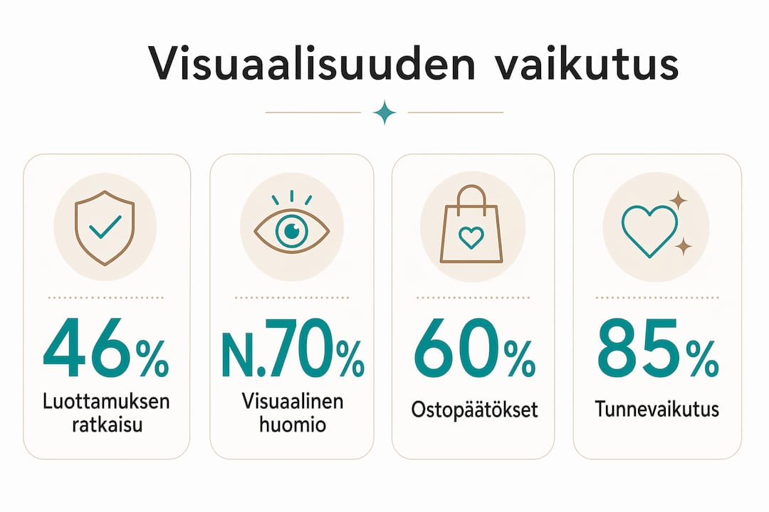
Visual elements don't just attract the eye; they directly guide purchasing decisions. In an MDPI Foods study in 2026, eye-tracking research showed that transparent window packaging attracted customer attention faster and increased purchase intent compared to traditional image packaging. Visuals increase attention span and improve customer perception of quality and purchase intent.

This finding is directly applicable to the hospitality industry and marketing. When a customer sees a visual representation of a product or space, their gaze first focuses on certain points, and the time they spend looking at a particular element correlates directly with interest and willingness to buy. Eye-tracking research is an effective tool for measuring the effects of visual design, and it can be used to identify which elements work and which go unnoticed.
| Visual Element | Impact on Attention | Impact on Purchase Intent |
|---|---|---|
| Transparent window or open view | Fast initial engagement, high | Significantly higher |
| Traditional image packaging or enclosed space | Slower engagement | Lower |
| Clear visual hierarchy | Guides gaze logically | Supports decision-making |
| Confused or cluttered layout | Distracts attention | Decreases conversion |
Practical example: a restaurant menu card with clear visual hierarchy, high-quality food photos, and consistent typography will make a customer spend more time on recommended items. This is not accidental but the result of design. The same principle applies to e-commerce product pages and marketing materials.
Pro Tip: Test your visual materials with eye-tracking research or simple A/B testing before widespread implementation. Even small changes in element placement can significantly increase attention engagement.
The effectiveness of visual marketing is based on the fact that humans process visual information much faster than text. Visual content for customers does not just mean photographs, but everything the customer sees: the shapes of the space, materials, lighting, and the relationship of colors to each other.
What is the Role of Visual Hierarchy in Customer Experience?
Visual hierarchy and signage determine how smoothly a customer moves through a space or website. An eye-tracking study conducted at Chengdu Metro stations showed that viewing height and lighting critically affect how well passengers absorb signage information. The effectiveness of visual signage depends on lighting and viewing height, and user perspectives should be extensively tested.
This research finding is directly applicable to restaurants, hotels, shopping malls, and event spaces. If signage is placed at the wrong height or in a poorly lit area, the customer will not find the information they need, which decreases satisfaction and increases staff workload. Optimizing visual hierarchy is also a matter of accessibility, not just aesthetics.
Building an effective visual hierarchy in a space or communication material proceeds as follows:
- Map the customer journey. Identify the order in which the customer moves through the space or navigates the page. Each point is an opportunity to direct attention correctly.
- Prioritize information. Decide which information is critical and which is secondary. Not everything can be equally important, as this leads to information overload.
- Test with different user groups. Children, the elderly, and people with disabilities view a space from different heights and perspectives. The functionality of signage must be ensured for everyone.
- Check lighting. The best sign is useless if it is in shadow or glare. Lighting is a key tool in visual hierarchy.
- Measure and iterate. Eye-tracking research or simple observation reveals which signs work and which go unnoticed.
Pro Tip: Experience your space through the eyes of a customer, literally: sit down, crouch, stand at the door. You will immediately see which signs and visual elements work and which don't.
Visual contrast is one of the most effective ways to direct attention to the right place. The use of contrast in spatial design improves both aesthetic impression and practical navigation. A dark background for light text or vice versa makes signs readable even in challenging lighting conditions.
How Do Visuals Affect Emotional Experience and Brand Engagement?
The impact of visuals on customer experience is not limited to conveying information; it extends directly to emotions and the perceived value of the brand. The PAD model (Pleasure, Arousal, Dominance) provides a framework for understanding how visual environments affect emotions: pleasure describes how positive the experience feels, arousal indicates the level of activation, and dominance refers to how much control the customer feels they have over the situation. The PAD model offers a framework to distinguish between aesthetic effects and cognitive clarity effects on customer experience.
In practice, this means that a restaurant aiming to create a relaxed and warm atmosphere should choose visual elements that increase pleasure and decrease arousal. High arousal is suitable for, for example, sports bars or fast-paced restaurants where customers want an energetic experience. A sense of dominance, in turn, arises from clear spatial arrangements and easily found services.
According to experience designer Mira Rahkonen, a consistent brand experience across all customer touchpoints increases engagement and creates an authentic impression. This means that a single visually impactful element is not enough; the entire customer journey must be visually cohesive. Consistent visual and service experience messaging strengthens customer loyalty.
Visuals and branding work best when the following elements are aligned:
- Physical space: Interior design, materials, lighting, and color scheme reflect brand values.
- Digital touchpoints: Websites, social media, and email communications follow the same visual language.
- Staff appearance: Uniforms and visual presentation support the overall impression.
- Packaging and materials: Menus, business cards, and takeaway packaging are part of the brand's visual communication.
- Soundscape and scent: These senses reinforce or weaken the overall impact of the visual experience.
Customer experience and design are not separate functions. When visual design permeates all touchpoints, the brand begins to feel familiar and trustworthy even before the first personal encounter.
Optimizing customer experience through visuals does not mean emphasizing every element. It means focusing on the points that support customer decision-making and reinforce the brand's message. Less is often more when every visual choice is well-considered.
Key Findings
Visuals are the most important single factor in customer experience because they influence trust, emotions, and purchasing decisions above all else.
| Point | Details |
|---|---|
| Trust is visually generated | Visual design determines trust in 46.1% of cases before content. |
| Attention guides purchasing decisions | Transparent and clear visual elements attract attention faster and increase purchase intent. |
| Hierarchy is accessibility | Signage height, lighting, and contrast directly affect information absorption for all user groups. |
| PAD model guides emotional experience | Pleasure, arousal, and dominance are measurable effects of the visual environment. |
| Consistency builds loyalty | A unified visual message across all touchpoints strengthens the brand's perceived value. |
Visuals are Strategy, Not Decoration
I have closely observed how hospitality companies invest in visual design, and one thing is consistent: those who treat visuals as a strategy achieve measurable results. Those who treat it as decoration get beautiful spaces where customers still get lost or leave quickly.
Research data strongly supports this observation. The figures from the Stanford Web Credibility Project do not surprise me, as I have seen in practice how quickly a customer makes conclusions about the quality of a restaurant or brand based solely on the visual first impression. It happens in seconds, not minutes.
One thing that typical articles don't emphasize enough: improving visuals doesn't mean renovating everything. Often, it's about three or four critical points in the customer journey where the visual experience is broken or inconsistent. When these points are fixed, the entire experience improves disproportionately. Look at the role of lighting in restaurant environments, and you'll understand how a single element can change the entire atmosphere of a space.
Another underestimated aspect: visual accessibility. Signage that works for a 35-year-old designer may not work for a 70-year-old customer or a child. The Chengdu Metro study reminds us that viewing height and lighting are concrete variables, not abstract concepts. Test your space with real people, not just your colleagues.
— Mikko
Dekoja Helps Build Visually Impactful Spaces
Visual impact is created by material choices, contrast, and how a space uses light and shadow. Dekoja supplies Musou Black paint, super black effect surfaces, and non-reflective materials from Finland, used by restaurants, galleries, architects, and interior designers to create memorable and distinctive spaces.
When you want to create a space where visuals function strategically, not just aesthetically, Dekoja offers both materials and expert support throughout the project from start to finish. Deliveries in 1–3 business days from domestic stock. Explore special materials and effect surfaces and request a quote for your B2B project.
FAQ
Why are visuals important in customer experience?
Visuals influence customer trust and emotions above all else. According to the Stanford Web Credibility Project, visual design determines trust in 46.1 percent of cases before content or functionality.
How does visual hierarchy improve customer experience?
A clear visual hierarchy guides customer attention in a logical order and reduces information overload. The Chengdu Metro study showed that signage height and lighting directly affect information absorption.
What does the PAD model mean in visual design?
The PAD model (Pleasure, Arousal, Dominance) describes how the visual environment affects the customer's sense of pleasure, arousal level, and control. It provides a measurable framework for evaluating the impact of visual choices.
How does a consistent visual identity affect a brand?
A consistent visual message across all customer touchpoints, in physical space, online, and in materials, strengthens the brand's perceived value and increases customer loyalty, according to Mira Rahkonen's experience design insights.
How can the impact of visuals be measured in practice?
Eye-tracking research measures where a customer looks first and for how long. A/B testing in digital channels and structured observation in physical spaces are practical methods for evaluating the effects of visual changes.