
Color therapy in interior design – A visual resource for restaurant spaces
Nearly 90 percent of customers say that the color scheme of a restaurant influences their first impression. Visual identity does not happen by chance, but successful space design requires the thoughtful use of color and contrast. Musou Black offers a unique opportunity to create striking contrast, drama and depth that will make your restaurant stand out from the competition and be remembered by customers.
Table of contents
- Color therapy in interior design – basics and misconceptions
- Psychological effects of colors on spatial experience
- Musou black and extreme contrast in the interior
- Examples of color therapy solutions in restaurants
- Typical mistakes and how to avoid them in design
Key findings
| Score | Detail |
|---|---|
| Psychological effects of colors | Colors significantly affect people's moods and experiences, so their use should be based on psychological effects. |
| Using Musou Black | Musou Black can create powerful visual effects, but its use requires careful consideration to maintain balance. |
| Color therapy in restaurants | The right colors can significantly shape customer experiences and behavior in restaurants. |
| Color design mistakes | The most common mistakes arise from the uncontrolled use of colors, which can create unpleasant environments. |
Color therapy in interior design – basics and misconceptions
Color therapy is an interesting concept that is generating a lot of discussion in interior design. It is based on the idea that colors have a direct connection to a person's psychological and emotional states. However, it is important to distinguish between scientific evidence of the effects of colors and purely imaginative theories.
Scientifically, the effects of colors are complex. Critical analysis by skeptics shows that while colors do have real psychological effects, many claims about color therapy lack scientific basis. For example, alleged connections to chakras and personality theories are more subjective beliefs than proven facts.
The use of color in interior design is based more on observed psychological effects than on mystical theories. Cool shades of blue can create a calm atmosphere, while warm reds and oranges bring energy to a space. Using these colors is more of an art than an exact science – it requires an understanding of color interaction, contrast, and the nature of the space.
Pro tip: Use colors wisely and focus on their real psychological effects, not mystical theories.
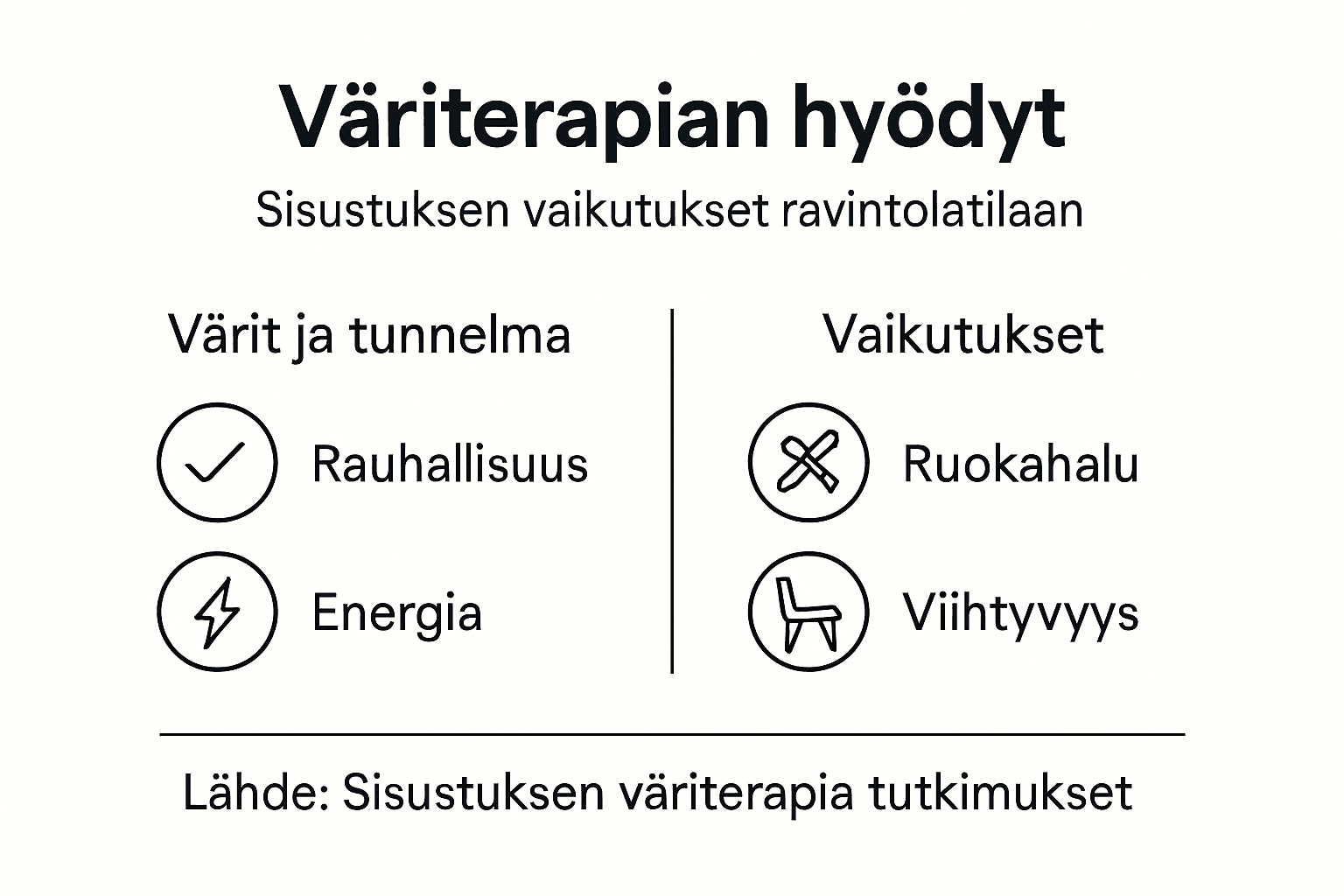
Psychological effects of colors on spatial experience
The psychological effects of color are a multifaceted phenomenon that significantly affects our spatial experience and state of mind. The effects of color on mood show that different shades of color can evoke different emotional reactions and physiological responses in us.
For example, shades of blue and green create a calm and safe atmosphere, while red and orange colors stimulate energy and appetite. From an artistic perspective, color therapy can be viewed more holistically – colors do not only affect the visual senses, but they also activate deeper psychological processes.
In restaurant spaces, color selection is especially critical, as it directly impacts customer experience and behavior. Warm tones can increase appetite and create an inviting atmosphere, while cool tones can create a calmer, more thoughtful atmosphere. The use of color is not just an aesthetic, but a strategic tool for shaping the mood of a space.
Pro tip: Choose the colors of your restaurant space thoughtfully, utilizing the psychological effects of colors, not just your preferences.
Musou Black and extreme contrast in the interior
Musou Black represents extreme contrast that can completely transform the visual appearance of a space. Color contrasts in interior design reveal how this intense black shade can create stunning visual effects that evoke strong emotions and experiences in the viewer.
This particular black color absorbs almost all light, making it a unique interior design element. However, using extreme contrasts requires careful consideration. Too much black can make a space feel oppressive, while used correctly it can add depth, drama and exciting visual dimension.
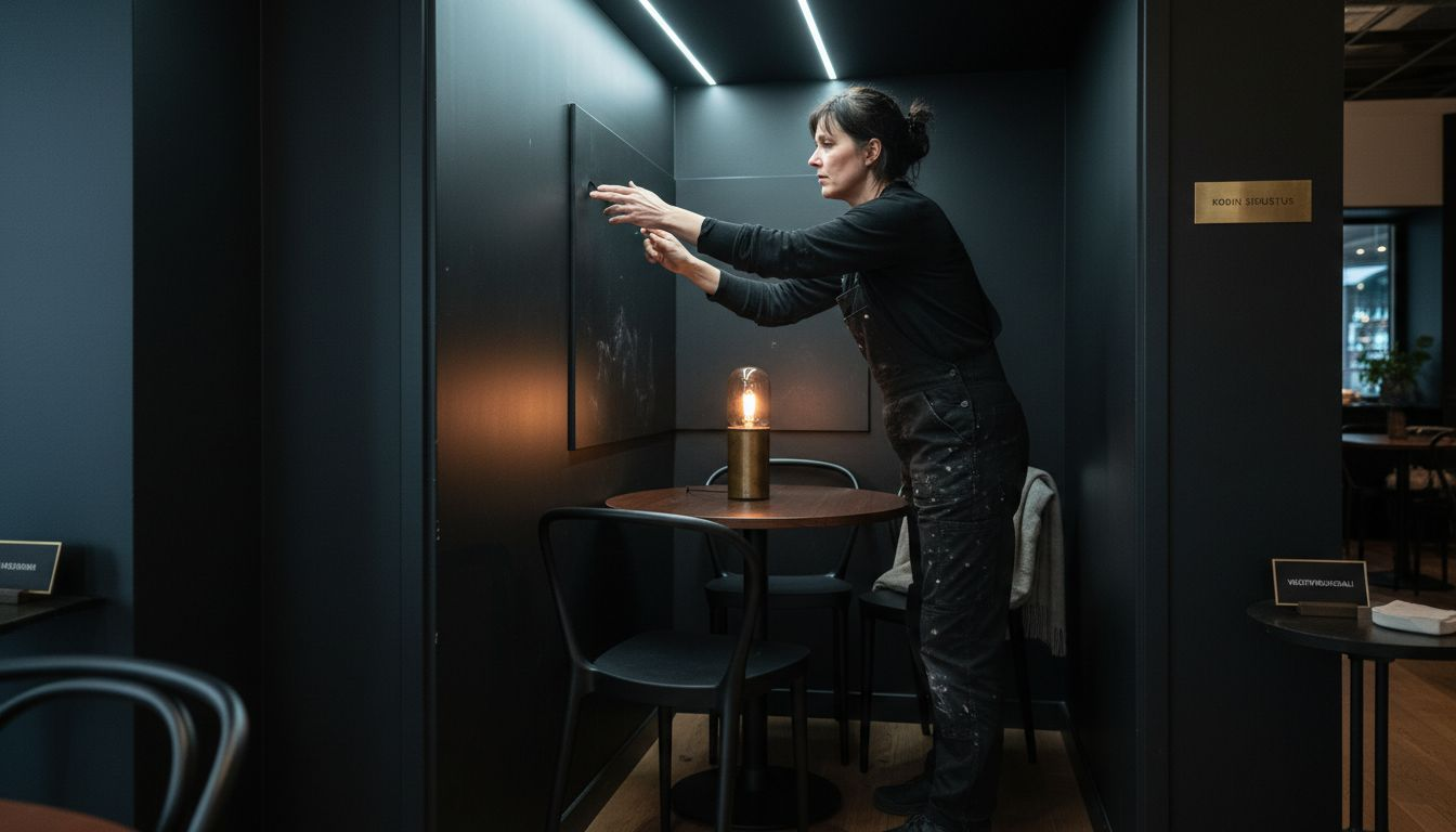
In restaurant spaces, Musou Black can be an effective way to direct the customer’s eye and create dramatic contrasting surfaces. For example, used as background walls or as individual interior elements, it can emphasize the shapes of the space and create surprising visual paths. However, the use of color requires balance – it is like the dark, deep sound of an orchestral violin, which must be perfectly dimensioned to the rest of the environment.
Pro tip: Use Musou Black judiciously as a small but effective contrast element, don't cover the entire space with black.
Examples of color therapy solutions in restaurants
The practical applications of color therapy in restaurants are multidimensional and require careful planning. The effects of colors on the atmosphere of a restaurant show how correctly chosen colors can significantly shape the experience and behavior of customers.
For example, red and orange tones stimulate appetite and social interaction. The psychological dimension of colors is particularly evident in restaurant environments, where colors can either attract customers or create a distant atmosphere. Yellow can bring energy, while blue creates a calm and trusting atmosphere.
In practice, applying color therapy in restaurant spaces means a holistic design. The color scheme of walls, furniture, lighting and details should be harmonized so that they support the restaurant concept and the nature of the dishes. For example, a modern sushi restaurant can utilize cool blue and gray tones to create a clean and rational atmosphere, while a traditional pizzeria might use warm red and orange tones to stimulate the appetite.
Below is a comparison of the typical psychological effects of different colors and their recommended uses in a restaurant environment:
| Color | Typical effect | Most suitable for use in a restaurant |
|---|---|---|
| Blue | Calms, builds trust | Fine Dining or cafes where relaxation is needed |
| Red | Stimulates, increases appetite | Pizzerias, burger restaurants and lively environments |
| Orange | Energizes, promotes discussion | Family restaurants, lunch places |
| Green | Relaxes, brings balance | Vegetarian restaurants, health and café environments |
| Yellow | Cheers up, creates positivity | Breakfast places, busy cafes |
| Black/Musou Black | Emphasizes, adds drama | Individual accent walls, atmospheric details |
Pro tip: Don't use colors haphazardly, but consciously design them to support your restaurant's concept and atmosphere.
Typical mistakes and how to avoid them in design
The pitfalls of color design are manifold, and they can ruin the entire atmosphere of a space. The importance of color in interior design reveals that the most common mistakes often arise from uncontrolled use of color and a lack of understanding of its psychological effects.
One of the most common mistakes is using too many colors at once, which can create a chaotic and unsettling environment. The power of color in interior design highlights that ill-considered color contrast can cause eye fatigue and distraction. In a restaurant space, this means that customers may find the space uncomfortable and want to leave quickly.
It is also important to understand the specific requirements of the space. For example, a fine dining restaurant requires a different color scheme than a casual café. Strong and bright colors may work in a youthful café, but they may be too distracting in a sophisticated restaurant. The colors should support the restaurant’s concept, menu, and target clientele.
The following table summarizes the most common mistakes in color design and provides ways to avoid them:
| Error | Possible consequence | Solution |
|---|---|---|
| Too many different colors | Chaotic atmosphere | Limit to 2–3 primary colors |
| Too strong contrasts | Eye strain | Use with caution, consider balance |
| A color scheme that is not suitable for the space | The purpose of the space remains unclear. | Choose colors according to your concept and clientele |
| Untested color combo | Unpleasant outcome | Test colors on a small scale beforehand |
Pro tip: Use a color chart and test color combinations on a small scale before making final decisions.
Take the atmosphere of your restaurant space to a new level with the power of color therapy
This article sheds light on how colors can have a powerful impact on customers’ mood and spatial experience in a restaurant. The challenge is to choose just the right shades that support your restaurant’s concept and create the desired atmosphere without using random colors. With materials like Musou Black, you can emphasize visual contrast and create a dramatic depth to the space that will be remembered.
Discover Dekoja.net's unique selection that combines aesthetics and technology. In addition to musou Black, we offer solutions such as lighting products that complement the benefits of color therapy and make your space an experiential whole.
Take the next step and create a visual identity for your restaurant that your customers will recognize and remember. Discover the whole package and easily order the products from the Finnish online store Dekoja.net today.
Frequently Asked Questions
What are the basic principles of color therapy in interior design?
Color therapy is based on the fact that colors have a direct connection to a person's psychological and emotional states. In interior design, colors are used thoughtfully for their psychological effects, not based on mystical theories.
How do different colors affect the atmosphere of restaurant spaces?
Different colors can evoke different emotions and reactions. For example, red and orange colors stimulate appetite and social interaction, while blue and green tones create a calm atmosphere.
What is the role of Musou Black in interior design?
Musou Black is an extreme black color that absorbs light and can create powerful visual effects. When used correctly, it adds depth and drama to a space, but when used excessively, it can make a space feel oppressive.
How to avoid common mistakes in color separation in restaurants?
Avoid using too many colors at the same time, which can create a chaotic atmosphere. It is recommended to limit the number of colors to 2-3 main colors and choose the colors carefully according to the restaurant concept and clientele.
Recommendation
- Introducing design elements into restaurant space planning – Dekoja.net
- Introducing design elements into restaurant space planning – Dekoja.net
- Introducing design elements into restaurant space planning – Dekoja.net
- Introducing design elements into restaurant space planning – Dekoja.net
- 10 Winning CEU Course Topics for Hospitality Manufacturers - CEU Builder