
The psychology of colors in interior design: 30% impact on appetite
Did you know that the color blue can reduce appetite by up to 30% compared to warm tones? Colors are not just aesthetic choices, they directly influence the emotions and behavior of your customers in your restaurant. As a decorator or restaurateur, you have the opportunity to utilize color psychology to create spaces that engage, calm, or energize in just the right way. In this guide, we'll walk you through how to understand the true effects of colors and how to build experiential restaurant spaces using visual contrast.
Table of contents
- Key lessons from the psychology of color in interior design
- Introduction: why color psychology is crucial in interior design
- The psychological effects of colors on the user of a space
- The importance of visual contrast and how to create it
- Commonly misunderstood color theories and how to correct them
- Combining colors with materials and light in spatial design
- Utilizing colors to enhance the experience of restaurant spaces
- Create impressive experiences with colors and contrasts
- Frequently asked questions about color psychology in interior design
Key lessons from the psychology of color in interior design
| Point | Detail |
|---|---|
| Colors control emotions and behavior | Warm colors increase energy and appetite, while cold colors calm and reduce stress in a space. |
| Visual contrast enhances the experience | Optimal contrast makes the space easier to perceive and deepens the experience. |
| Misconceptions hinder planning | Black doesn't always make a space smaller, and blue can also be used in a restaurant if applied correctly. |
| Materials and light work together | Colors look different on different surfaces and lighting conditions, testing is essential. |
| Colors are a competitive advantage in restaurant spaces | The right color choices extend customer stay and strengthen brand identity. |
Introduction: Why color psychology is crucial in interior design
Colors are not just a surface. They directly affect how a space feels and how your customers behave there. Studies show that colors shape mood, energy levels, and even cognitive functions like memory and concentration. As a decorator or restaurateur, it’s your job to understand these effects and put them into practice.
In today's competitive environment, simply having good food or an aesthetic appearance is not enough. Your customers are looking for experiences, spaces they want to stay in and talk about. Understanding color psychology can help you create just such spaces. When you combine color psychology with visual solutions such as highlighting light in restaurant interiors , you create a whole that connects customers to the core of the place.
In this guide, we’ll explore the emotional impact of color, the importance of contrast, and practical applications for restaurants. Every color choice is an opportunity to enhance the ambiance of your space and build a competitive advantage that sets you apart from the rest.
Pro tip: Always start with your customers’ target mood. Do you want them to relax, energize, or focus? Choose colors accordingly.
Key considerations when applying color psychology:
- The effects of colors vary by culture and individual, so test solutions with your target audience.
- Don't rely solely on intuition, utilizing research information will help you avoid mistakes.
- Always combine colors with lighting and materials to maximize the overall effect.
The psychological effects of colors on the user of a space
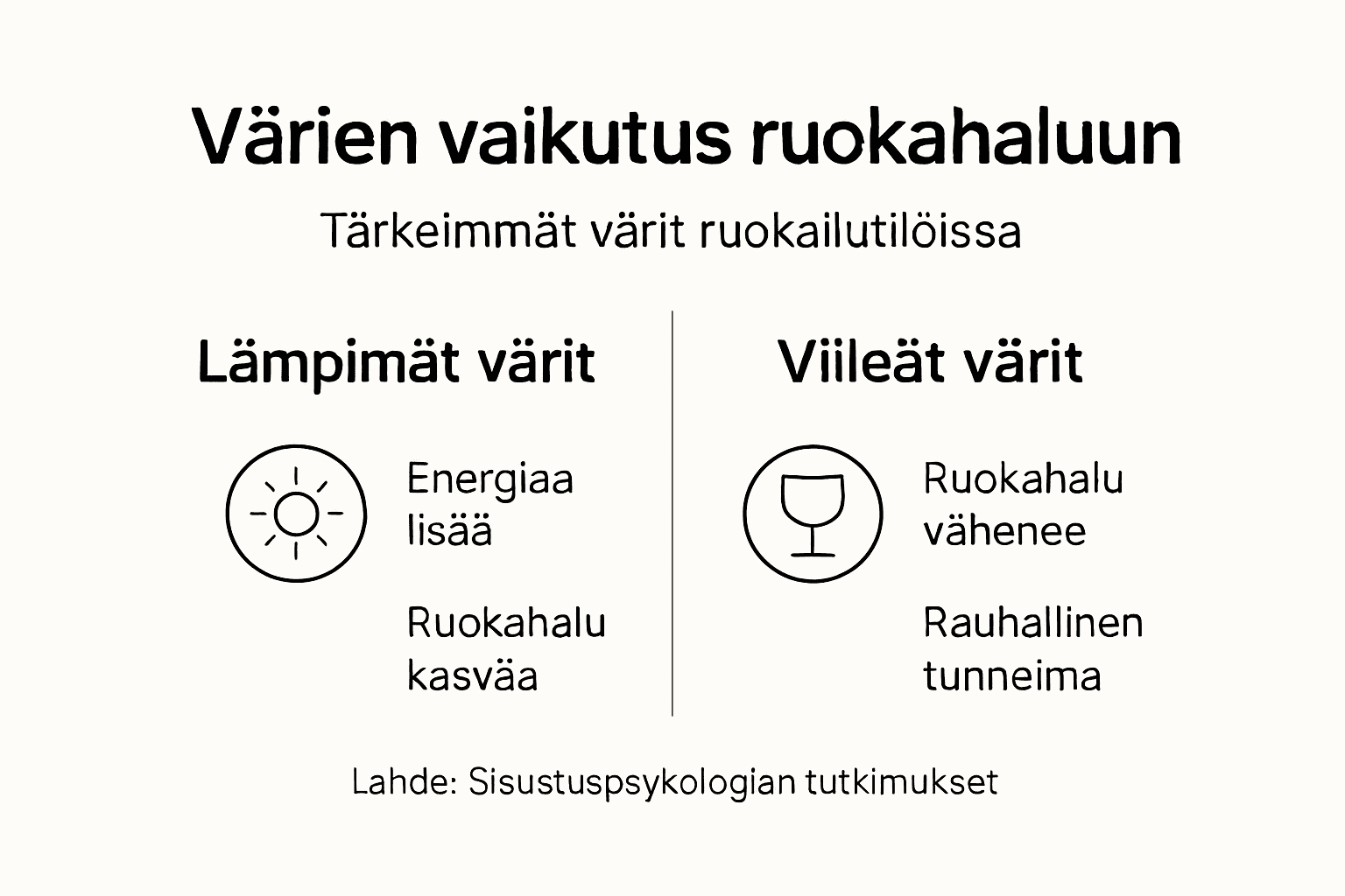
Colors control behavior in ways you may not realize. Red increases energy levels and appetite, making it popular in fast-food restaurants . It increases heart rate and creates a sense of urgency, which makes customers eat faster and move tables more often. Orange and yellow evoke joy and social interaction, making them ideal for family-oriented restaurants.
On the other hand, blue is calming and reduces stress, but at the same time, blue can reduce appetite by up to 30% compared to warm tones. This can be useful in relaxing spaces or cocktail bars where you want customers to linger longer over drinks. Green evokes nature and balance, which supports well-being and peace. It works especially well in health food or vegetarian restaurants.
The effect of colors on behavior in a restaurant:
- Red: Stimulates appetite and speeds up eating, suitable for rapid turnover.
- Blue: Calms and reduces appetite, suitable for bars and lounges.
- Yellow: Inspires positivity and energy, suitable for breakfast restaurants.
- Green: Creates a sense of balance, suitable for health restaurants.
- Black and dark shades: Create luxury and drama, suitable for fine dining restaurants.
Statistic callout: Studies show that warm colors can increase customers' energy levels by up to 15% compared to neutral tones, which directly affects dwell time and purchase intention.
When designing a restaurant space, consider the impact of colors in conjunction with lighting and contrast. Colors do not work in a vacuum, but their impact depends on the surrounding context.
The importance of visual contrast and how to create it
Contrast is one of the most effective tools for creating depth and excitement in a space. Studies show that contrasts with a 60-70% difference in luminance are optimal for visual perception . Too little contrast makes a space appear flat and dull, while too much contrast can feel unsettling and distracting.
Musou Black paint offers a unique opportunity to create dramatic contrast. It absorbs up to 99.4% of visible light, making it one of the blackest paints in the world. When combined with well-designed lighting, Musou Black creates a depth that ordinary matte black can never achieve. This is especially suitable for restaurants where you want to create an intimate, luxurious or dramatic atmosphere.
Ways to create contrast in a restaurant:
- Combine dark walls with light furniture or lighting.
- Use Musou Black paint finishes to highlight specific elements or artwork .
- Create contrast between different materials: shiny vs. matte, rough vs. smooth.
- Use lighting to create light-shadow contrasts that deepen the space.
The effects of contrast in a restaurant:
| Contrast type | Visual impact | Emotional impact |
|---|---|---|
| Strong dark-light | Emphasizes shapes and depth | Create drama and tension |
| Contrast of materials | Add texture and interest | Stimulates curiosity and a desire to touch |
| Light-shadow contrast | Directs the eye and creates layers of space | Brings intimacy and warmth |
| Color contrast | Separates areas from each other | Supports functional use of space |
Pro tip: Test contrast solutions in small areas first. Paint one wall with Musou Black and observe how the lighting and other colors react to it at different times of day.
Properly executed contrast is not only an aesthetic choice, but it supports the customer experience and improves the perception of the space. Take advantage of highlighting light in restaurant interiors to maximize the impact of contrast.
Commonly misunderstood color theories and how to correct them
There is a lot of misinformation circulating about color psychology that can lead to poor design decisions. One of the most common misconceptions is that black always makes a space smaller. In reality, a well-executed black wall combined with the right lighting can make a space feel more spacious and deeper. Contrast creates perspective that broadens the experience of the space.
Another misconception is about the color red. Many people believe that red is always exciting and restless, but its shades can be controlled. A dark red or burgundy can be a noble and calming choice for a fine dining restaurant, while a bright red works in an energetic fast food restaurant.
Blue is often considered completely inappropriate for restaurants because it reduces appetite. However, this is not always a bad thing. In cocktail bars or lounges where customers are expected to linger over drinks, blue can be a strategic choice.
Common misconceptions about colors:
- Black always makes a space smaller: In reality, contrast and lighting determine the experience of a space.
- Red is always exciting: The shades and combinations of red significantly change its emotional impact.
- Blue is not suitable for restaurants: Suitable for lounges, bars and relaxed restaurants.
- Colors affect everyone in the same way: Cultural background and individual experiences influence the interpretation of colors.
- Visual contrast is not just an aesthetic choice: It also supports the use of space, perception, and atmosphere.
By understanding these misconceptions, you can make bolder and more informed color choices that truly support your restaurant concept and customer experience.
Combining colors with materials and light in spatial design
Colors do not live alone. Their effect depends entirely on how they combine with materials and lighting. The same color looks completely different on a glossy ceramic surface than on a rough wooden surface. The surface roughness, gloss and structure of materials change the reflection of light and thus the experience of color.
Lighting is the most critical factor in bringing out colors. Warm lighting enhances the depth and vibrancy of warm colors, while cool lighting can make them appear gray and lifeless. Poor lighting can dull even the best-chosen colors. Always test colors and materials in different lighting conditions before making final decisions.
Interaction of materials and colors:
- Glossy surfaces reflect light and enhance colors, but can create distracting reflections.
- Matte surfaces absorb light and create a deeper, calmer atmosphere.
- Rough surfaces add texture and interest, but can darken colors.
- Translucent materials such as glass or acrylic create layered color effects.
Pro tip: Take your color samples with you to the restaurant and view them at different times of day and in different lighting conditions to ensure that the colors work in all conditions.
When designing a restaurant space, think about colors, materials, and lighting as a whole. Utilize the combination of materials and colors to create layers and depth in the space. Testing is the key: don’t rely on just a plan, but make sure the colors and materials work together in the actual space.
Utilizing colors to enhance the experience of restaurant spaces
When you combine knowledge of color psychology with practical design, you create experiential restaurant spaces that stand out from the competition. Warm colors such as red, orange and yellow increase customer energy and comfort. They create social warmth and can increase dwell time. In fine dining restaurants, dark, luxurious colors such as black, navy blue or burgundy emphasize exclusivity.
Musou Black paint offers a unique opportunity to create dramatic depth and contrast. When combined with properly designed lighting, the result is a visual effect that will make customers stop and marvel. Musou Black not only absorbs light, it creates a space where the light really shines. This makes it an ideal choice for restaurants that want to highlight specific elements, such as artwork, wine cabinets or lighting solutions.
Practical steps for utilizing color in a restaurant:
- Define the restaurant's concept and desired atmosphere: Energetic and fast or calm and intimate?
- Choose primary colors according to the concept: Warm colors for energy, cold ones for calming.
- Create contrast with Musou Black paint: Highlight specific walls or elements.
- Test colors and materials together: Make sure they work in different lighting conditions.
- Collect customer feedback and adjust: Fine-tune colors and lighting based on feedback.
The effect of colors on customer behavior in a restaurant:
| Color | Effect on appetite | Effect on dwell time | Suitability for the type of restaurant |
|---|---|---|---|
| Red | Add 15-20% | Shorten (fast rotation) | Fast food restaurants, casual dining |
| Blue | Reduces by 30% | Prolong | Bars, lounges |
| Yellow | Add 10-15% | Shortens (energizing) | Breakfast restaurants, cafes |
| Black/dark | Neutral | Extend (intimate) | Fine dining, cocktail bars |
Always consider the overall look that fits your restaurant concept. Take advantage of the use of matte black in restaurant interiors and check out Musou Black paint options and uses in restaurant spaces for more inspiration. Colors are a competitive advantage that sets you apart from others and creates memorable experiences for your customers.
Create impressive experiences with colors and contrasts
Dekoja.net offers you the tools to put the principles of color psychology into practice. Musou Black paint brings a unique depth and contrast to your restaurant, making lighting shine in a new way. It is not just paint, but a way to create spaces that will be remembered.
We have helped numerous restaurants and interior designers in Finland create experiential spaces that utilize the power of color and lighting. We offer matte black paint solutions for restaurants and expert support from design to implementation. When you combine knowledge of color psychology with the right materials and high-contrast lighting , you create a space that speaks to your customers on a deeper level. Get in touch and create spaces that truly stand out.
Frequently asked questions about color psychology in interior design
How to choose the right colors for a restaurant concept?
Start by assessing your restaurant’s goals, target audience, and desired atmosphere. For an energetic casual dining venue, choose warm colors like red and orange, which increase appetite and social interaction. For a fine dining restaurant, choose dark colors that create a sense of luxury. Always match colors with lighting and materials to create a cohesive whole so that the end result supports the desired customer experience.
Can the color blue reduce appetite in a restaurant?
Yes, studies show that the color blue can reduce appetite by up to 30% compared to warm colors. However, this is not always a disadvantage. In cocktail bars and lounges, where customers are expected to linger over drinks, blue can be a strategic choice. Always match the color to the restaurant concept and clientele.
What makes Musou Black paint special in interior design?
Musou Black is a highly matte and pigmented paint that absorbs up to 99.4% of visible light. It creates a dramatic contrast and depth that ordinary matte black cannot achieve. When combined with properly designed lighting, it creates a visual effect that emphasizes light and other elements in a space. Discover the properties of Musou Black paint and find applications for your restaurant.
How much does lighting affect the experience of colors in a space?
Lighting significantly changes the visibility and mood of colors. Warm lighting emphasizes the depth of warm colors, while cold lighting can make them look gray. Poor lighting can dull even the best-chosen colors. Well-designed lighting in restaurant interiors, combined with appropriate colors, maximizes the impact and creates the desired atmosphere.
How to test colors before making a final interior design decision?
Make color samples and observe them under different lighting conditions at different times of the day. Paint a small area or use loose samples that you can place in different places in the restaurant. Use virtual design tools to visualize the whole. Gather feedback from your staff and trusted customers before making a final decision to ensure the colors work in practice.