

Light Absorption: Understand, Utilize, and Control in Interior Design
TL;DR:
- Surface darkness is not just a color; it's a complex phenomenon influenced by structure and lighting conditions. Light absorption means that photon energy is transferred to the material, generating heat, which affects a space's contrast and temperature. In design, it's crucial to balance absorbent surfaces with reflective elements, as this impacts the space's ambiance and functionality.
Many designers choose dark surfaces "for the mood" without considering in depth what actually happens to the material when light hits it. The truth is, surface darkness is not just a color property. It's a complex phenomenon influenced by the material's structure, the texture of the surface layer, the light spectrum, and even the viewing angle. When you understand how light is absorbed, reflected, and scattered on different surfaces, you can make design decisions that work in a real environment and not just in reference images.
Table of Contents
- What does light absorption mean in a material?
- Reflection, transmission, and absorption: find balance in spatial design
- Spectrum, angle, structure – why not all blacks are created equal
- How and why is absorption measured and modeled?
- Light absorption in practice: design guidelines and examples
- Why light absorption is still misunderstood – a designer's perspective
- Practical implementation and inspiration for light and contrast surfaces
- Frequently asked questions about light absorption in design
Key Takeaways
| Point | Details |
|---|---|
| Absorption is more than color | The effect of coating and structure on light absorption determines the true contrast and atmosphere. |
| Reflection, transmission, and absorption | These three phenomena must always be weighed together when seeking the right illumination or shading for a space. |
| Spectrum and angle determine the outcome | The same black can look different depending on the light direction and spectrum – evaluate in practice, don't rely solely on color charts. |
| Measure and compare, don't assume | The right measurement method and precise analysis yield the best contrast and effect without surprises. |
| Utilize absorption as a design tool | By mastering the basics of light absorption, you can create atmospheric, functional, and unique spaces. |
What does light absorption mean in a material?
Light absorption is a phenomenon where light hitting a material is neither reflected nor transmitted, but instead transfers its energy to the atoms and molecules of the material. In practice, this means that the energy of photons typically converts into heat. In light absorption, a substance converts the absorbed radiant energy into other forms, usually heat, and dark surfaces absorb more light and heat up more than light surfaces.
This leads to a practical consequence: the more light a surface absorbs, the less is reflected back to the eye. The eye interprets this as a dark or deep color. But absorption is not the same everywhere in a material or at all wavelengths.
Examples help concretize the matter. Black textile fabric absorbs a large part of visible light, but different fabrics absorb varying amounts depending on the fiber structure, surface roughness, and dye. Special paint surfaces designed for designers, on the other hand, have been developed to have a significantly higher absorption percentage than ordinary black paint. The difference between these is clearly visible in a space: the special paint creates a visual depth that ordinary paint cannot replicate.
Light absorption is not just about what color a surface is. It's about how much of the photons' energy remains in the material and never returns to the viewer's eye.
Heat accumulation is a side effect of absorption that is worth knowing about, especially in restaurants and hotel rooms. A dark-painted wall in direct sunlight can accumulate significant heat. This must be taken into account, especially when designing an absorbent surface in public spaces where lighting is strong and continuous. Learn more about light absorption in spatial design if you want to understand the broader implications of the phenomenon for your project.
A key concept is also that absorption is wavelength-dependent. A material can absorb blue light efficiently but reflect red. This creates a color illusion: the surface appears red, even though it absorbs other wavelengths. In spatial design, this means that achieving the correct absorption property requires material knowledge, not just a visual estimate.
Below are listed the most important basic concepts for absorption:
- Absorption: the transfer of photon energy to material molecules
- Absorptance: the proportion of absorbed radiation to total radiation (on a scale of 0–1)
- Heat accumulation: the conversion of absorbed energy into heat in the material
- Spectral selectivity: different absorption of various wavelengths in the same material
Reflection, transmission, and absorption: find balance in spatial design
The fate of light in a material is always divided into three parts. The total effect is divided into reflection, transmission, and absorption, and these are measured by absorptance, transmittance, and reflectance. Summed together, these three values always equal one, or 100 percent. If reflection increases, absorption or transmission decreases.
This triple division is the designer's most important tool when selecting surface materials for a space. Clear glass allows almost all light to pass through and absorbs very little. Matte black special paint absorbs over 99 percent and reflects negligibly. Ordinary white wall paint reflects 80–90 percent and absorbs the rest.
The following table illustrates typical values for different surfaces:
| Surface Material | Reflection (%) | Transmission (%) | Absorption (%) |
|---|---|---|---|
| Clear glass | 8 | 90 | 2 |
| White wall paint | 85 | 0 | 15 |
| Ordinary black paint | 5 | 0 | 95 |
| Musou Black special paint | under 1 | 0 | over 99 |
| Black acoustic fabric | 3–8 | 0 | 92–97 |
| Brushed steel | 60 | 0 | 40 |
The table clearly shows why not all black surfaces function the same way in a space. Special paint and ordinary black paint are in different categories in terms of absorption.
When designing a space where you seek contrast or a dramatic atmosphere, balance is key. An absorbent wall works best when next to something that reflects: a metallic element, a glossy floor, or an illuminated tabletop. Contrast isn't solely created by a dark surface, but by a dark surface in relation to a lighter or more reflective element.
Practical design guidelines for finding balance:
- First, determine the main function of the space: is it an atmospheric restaurant, a minimalist hotel room, or a gallery?
- Choose one surface where you want maximum absorption. Most often, this is a background element or a ceiling view.
- Balance the absorbent surface with a reflective element that brings light back into the space.
- Check how lighting affects it: direct spotlight accentuates absorption, indirect light evens out contrast.
- Consider heat management, especially if the absorbent surface is in direct sunlight.
Learn more about design paint finishes and light absorption when you are ready to choose the right coating for your project.
Spectrum, angle, structure – why not all blacks are created equal
At this point, many designers are surprised. Two black surfaces can look different simply because their structure or spectral properties differ. The contrast in interiors should not be derived solely from color, as the same material can be reflective or absorbent differently spectrally and angle-dependently, and porosity and scattering change the light penetration and absorption distribution.
A concrete example: matte black paint and glossy black paint can be exactly the same color, but the glossy one reflects more light in spotlight and therefore appears lighter from certain angles. The matte surface scatters reflection more broadly and feels more uniformly dark to the eye.

In porous materials, the propagation of light can be described by a diffusion model, where the effect of scattering is much greater than the direct absorption described by the absorption coefficient. In practice, this means that a porous acoustic panel surface behaves optically differently from a smooth painted wall, even if both are the same shade.
The following table illustrates the optical properties of different surface structures:
| Surface structure | Spectral absorption | Angle dependence | Effect of scattering |
|---|---|---|---|
| Smooth matte paint | Uniform across all wavelengths | Low | Minor |
| Smooth glossy paint | High, wavelength-selective | High | Small |
| Porous acoustic panel surface | Variable, depending on structure | Low | Significant |
| Textile surface, pile | High (absorption into corners) | Very low | Moderate |
| Special black coatings | Very high across all wavelengths | Very low | Very small |
The effect of viewing angle is one of the most underestimated factors in spatial design. When your guests sit in a restaurant viewing a wall from different angles, they see the same surface differently. A skillfully chosen special paint minimizes angle dependence and maintains a deep black impression from all directions.
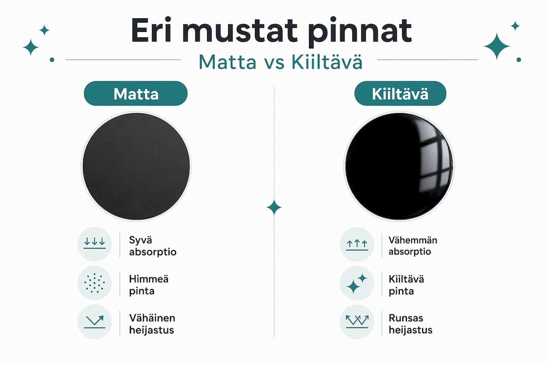
Pro tip: when you want to create a truly "striking" depth in a space, choose a material whose absorption is high both from a normal angle and from side angles. A matte surface that only works when viewed directly can betray from side angles and ruin the atmosphere. Always test the material under both spotlight and indirect lighting before making a final decision. Learn about the black effect and light absorption for more information on building depth effects.
How and why is absorption measured and modeled?
When a design project requires precise light control, such as a gallery, studio space, or design restaurant, intuition alone is not always enough. Evaluating absorption is not always straightforward, because so-called "lost light" can be absorption, but also transmission, scattering, or even an artifact caused by the measurement setup.
Measuring light absorption requires considering the optical properties of materials, such as the complex refractive index, and applying Fresnel's theory. This sounds complicated, but from a designer's perspective, it is essential to know what is behind the measurement results so that one can ask the material supplier for the correct information.
The most common measurement and modeling methods in design:
- Spectral measurement: measures how much of each wavelength is absorbed, reflected, or transmitted. This provides the most accurate picture of the material's actual behavior.
- Angle analysis (BRDF measurement): determines how absorption and reflection change when the light beam or viewing angle changes. Important for spaces where users move around.
- Diffusion modeling: especially for porous and textured surfaces where scattering plays a significant role.
- Beer–Lambert law: the simplest model for homogeneous materials where light passes straight through. Used especially in calculating the absorption of dyes.
- Kubelka–Munk model: more suitable for paint films and pigmented surfaces where scattering and absorption occur simultaneously.
Pro tip: In a project where you are choosing a surface material to create dark contrast, ask the supplier for spectral absorptance data and a BRDF profile. Mere "99% absorption" does not indicate at which wavelengths or angles the value was measured. The number may be genuine, but the context determines whether the material is suitable for your specific situation. You can get a more detailed understanding of measurements by familiarizing yourself with light absorption and measurement.
Modeling tools are increasingly part of the professional design process. Lighting simulation software, such as Radiance or DIALux, can utilize spectral absorptance data and predict how a space will look under different lighting conditions. This saves costly purchasing mistakes and material trials.
Light absorption in practice: design guidelines and examples
Theory becomes valuable only when it manifests as concrete choices in a space. Absorption is the uptake of radiant energy into matter, and some radiation is reflected away: in the case of Earth, about one-third is reflected and two-thirds are absorbed. The same principle applies to building surfaces, but the designer can choose which way the ratio leans.
In a restaurant, an absorbent ceiling surface creates a dramatic effect: the guest's gaze does not travel upwards but stays within the space. This directs attention to the table company and the food serving. In a hotel room, an absorbent wall panel on the back wall makes the bed feel like a floating element in front of emptiness. In a gallery, a black wall is a neutral frame that does not compete with the artwork.
Practical applications of absorption in spatial design:
- Creating ambiance in restaurants: a black or very dark ceiling with spotlights creates intimacy and psychologically defines the space
- Contrast walls in accommodations: an absorbent background element highlights furniture and textiles placed against it
- Acoustic solutions: a porous dark surface both absorbs light and reduces sound reflections, a dual solution for open-plan spaces
- Visual surfaces in exhibition spaces and galleries: very high absorptance minimizes distracting reflections
- Ambiance in private sauna facilities or bathrooms: matte black stone texture or coating creates a sense of luxury
- Set design for pop-up spaces and events: temporary absorbent fabrics or foils effectively transform a neutral space
Practical checklist for utilizing light absorption in your project:
- Is the main lighting source in the space direct or indirect?
- Where in the space is maximum contrast needed?
- Is the absorbent surface exposed to sunlight, causing heat discomfort?
- Is spectral data available for the material, and does it cover the visible light range?
- Is there a reflective element nearby to balance the absorbent surface?
- How can maintenance and cleaning be managed with the chosen surface?
For more tips and comparisons, check out the best light-absorbing paint finishes, where you'll also find comparative information between different products.
One often-overlooked aspect is the floor. A black glossy floor reflects more than a matte one, due to the strong mirror-like reflection from its surface. In contrast, a matte black floor creates a sense of depth without distracting reflections. This solution works particularly well in restaurants aiming to create a luxurious feel without visual noise.
Why light absorption is still misunderstood – a designer's perspective
The most common mistake in the industry is equating absorption directly with shade or color code. A designer chooses RAL 9005 or NCS S 9000-N and assumes that's enough. It's not enough.
Two black surfaces can share the same color code but behave completely differently in a space. One shines under a spotlight, the other absorbs it. One turns gray when viewed from an oblique angle, the other remains deep black. This difference is not in the color code but in the material data.
Surprising sources of error also arise from measurement biases. Lost light is not always absorption: it can be transmission, diffusion, scattering, or measurement error. This means that "99% absorption" can be measured in a way that doesn't correspond to real-world conditions. A designer who knows this can ask the right questions: what measurement method, what geometry, and what spectral range was the value measured in?
Experience shows that the biggest leap in design quality occurs when moving from assumptions to measurement. This doesn't mean every project requires laboratory tests. It means asking the supplier for real data and making a test piece in the correct space with proper lighting before placing an order.
Deep black effects, sought after in modern restaurant and hotel design, are not created by mere dark color. They arise from the interplay of material and lighting. The guide on deep black and artifacts details how to technically build the effect correctly.
One final piece of advice: don't underestimate angles. A space where there isn't a single point from which light hits a surface directly is rare. Always design for the angle variation that occurs in real use. Test the surface from multiple directions, with multiple lighting conditions, and at different times.
Practical implementation and inspiration for light and contrast surfaces
Once the overall picture of light absorption begins to emerge, the next step is to find materials and solutions that work for your specific project. Dekoja.net offers designers and projects specialized materials not found through ordinary channels: Musou Black paint, super black fabrics, and studio surfaces directly from domestic stock, with delivery in 1–3 business days.

Explore inspiration in spatial design and find concrete examples of how absorption has been utilized in restaurants, hotels, and galleries. When you're ready to choose a material, check out the most effective design paint finishes and compare the spectral properties of the products. For B2B customers and design agencies, we offer project-specific expert assistance from start to finish.
Frequently asked questions about light absorption in design
Can a black surface always absorb all light?
No. Dark surfaces absorb more light than light ones, but most blacks absorb a large portion, not all, as absorption is affected by material structure and spectral properties.
What distinguishes design paint from ordinary black paint in terms of absorption?
In design paint, absorption and reflection are spectrally and angularly optimized, whereas in ordinary paint, these values are random. Spectral and angle-dependent properties crucially affect the true functionality of the surface in a space.
What is the practical difference between absorption and albedo?
Absorption refers to the energy retained, albedo to the reflected portion: the higher the albedo, the less is absorbed. Earth's albedo varies between approximately 33–36 percent, meaning about one-third of radiation is reflected and two-thirds are absorbed.
Why can there be discrepancies in measurements for absorption assessment?
Measurement geometry, scattering, and transmission can cause some light not to be perceived as absorbed. Assessing absorptance requires a clear definition, as spectrum, viewing angles, and measurement setup significantly influence the final result.