

The Psychology of Black: A Guide to Mood Management
TL;DR:
- Black is a powerful element in interior design that can add elegance but also create a heavy atmosphere. Its psychological effects vary by culture and individual experience, requiring careful use and balance. When used correctly, black can soothingly reshape the experience of a space and emphasize dignity, but excessive use leads to withdrawal and claustrophobia.
Black is one of the most powerful choices in interior design. The psychology of the color black is contradictory: the same shade can create elegance and dignity in a space, but if used incorrectly, it can weigh down the atmosphere. It's a color that doesn't leave you cold. A designer who understands the psychological effects of black can make a space unforgettable. This guide explores what black truly does to the mind, how it shapes the experience of a space, and how to use it to achieve a functional, not heavy, result.
Table of Contents
- Key Takeaways
- The Psychology of Black and its Impact on Emotions
- Black's Impact on Mood and Spatial Perception
- The 60-30-10 Rule for Mastering Black
- Practical Tips for Utilizing Black
- My Perspective on the Power of Black
- Put Black Surfaces into Practice with Dekoja's Selection
- FAQ
Key Takeaways
| Point | Details |
|---|---|
| Black evokes strong emotions | The psychological effects of black vary significantly with culture and personal experiences. |
| The surface determines the atmosphere | Matte black absorbs light and creates depth, glossy black reflects light and adds drama. |
| 10% is an appropriate proportion | According to the 60-30-10 rule, black works best as an accent color, making up about 10 percent of the space. |
| Color combinations soften the effect | Warm butter yellow or a light shade alongside black makes the space inviting, not heavy. |
| Lighting is critical | The impact of black on mood directly depends on the amount of natural or artificial light in the space. |
The Psychology of Black and its Impact on Emotions
Black is not neutral. It carries layers of culture, personal history, and context. The psychological meaning of black is individual and culturally bound: it can convey formality, withdrawal, or grief, depending on who encounters the color and in what context.
In Western culture, black is traditionally associated with mourning and death. At the same time, it is the color of fashion, architecture, and luxury brands. This duality is the essence of black: it is a symbol of both loss and prestige.
Studies have shown that the human need to control emotional life is reflected in color choices. Choosing or avoiding black can be a subconscious way to regulate one's inner world. When a person wants to withdraw or protect themselves, black acts as a psychological shield.
Psychological meanings of black in different contexts:
- Elegance and dignity: Luxury products, formal attire, and fine dining restaurants use black to communicate quality and consideration.
- Mystery and withdrawal: Black invites contemplation of what lies beneath the surface. It reduces information overload and creates space for thought.
- Grief and loss: In Western culture, the color for funerals is black, which makes it emotionally heavy in certain situations.
- Power and control: The use of black in a space or outfit can enhance a sense of control. It is a color that neither forgives nor asks for permission.
- Calming: When used correctly, black transforms spatial perception in a calming way, especially in private spaces where the aim is to shut out the outside world.
Color psychology always takes into account an individual's life story and cultural layers. The same black wall can feel safe to one person and oppressively confining to another. For this reason, using black requires sensitivity and reading the situation.
Black's Impact on Mood and Spatial Perception
The impact of black on mood is concrete and physical, not merely symbolic. Color changes how the brain processes space.
Matte black absorbs light and creates an illusion of depth. It makes a wall visually disappear, which can make a space feel both larger and more spiritual. Glossy black works in reverse: it reflects light, adds drama, and draws attention to its surface. Both can be consciously used to build the atmosphere of a space.
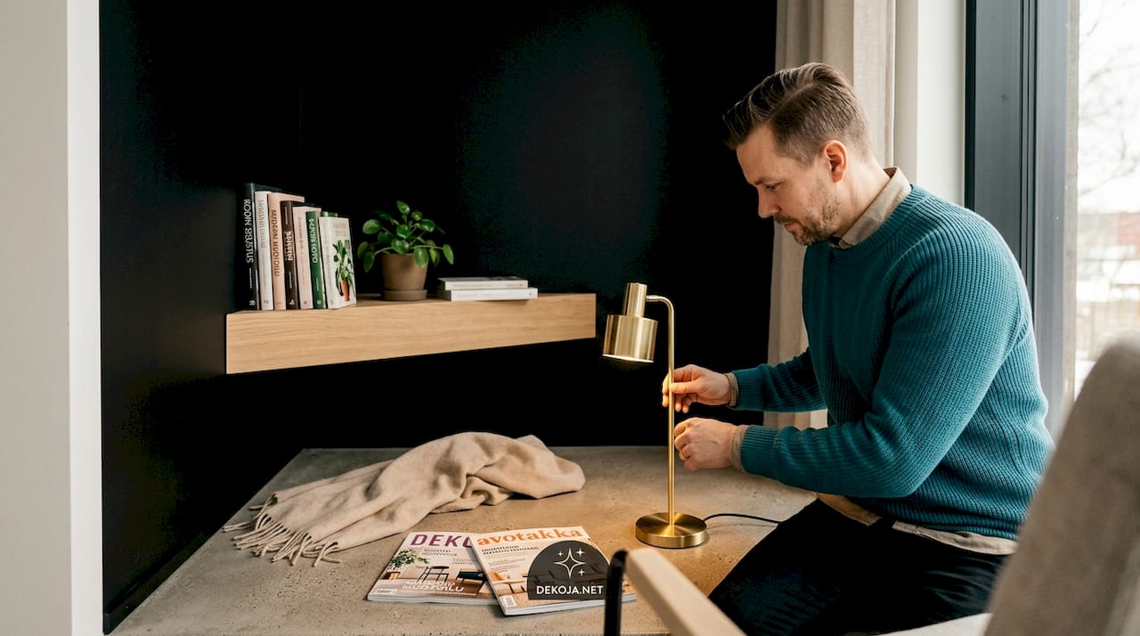
However, excessive use of black is a common mistake. When black covers the ceiling, floor, and walls, the brain interprets the space as enclosed. Black is associated with sophistication and mystery, but excessive use can cause a feeling of claustrophobia and make the space heavy.
Effects of black in different spaces:
- Office space: A black accent color adds clarity and helps with concentration. An entirely black office space can feel oppressive after a long day.
- Living room: A black wall behind artwork or a television creates a visual anchor and makes other furnishings stand out more clearly.
- Bedroom: Black curtains or an accent wall can calm the space and facilitate sleep, provided light levels are controlled.
- Restaurant or bar: In professional environments, black is an effective tool for creating dense, intimate atmospheres. The psychological effect of color on appetite is also documented.
Professional tip: First, try black on a single wall or a large piece of furniture. Observe the space's atmosphere at different times of day and in various lighting before expanding the proportion of black. This one step will save a lot of remedial work.
The 60-30-10 Rule for Mastering Black
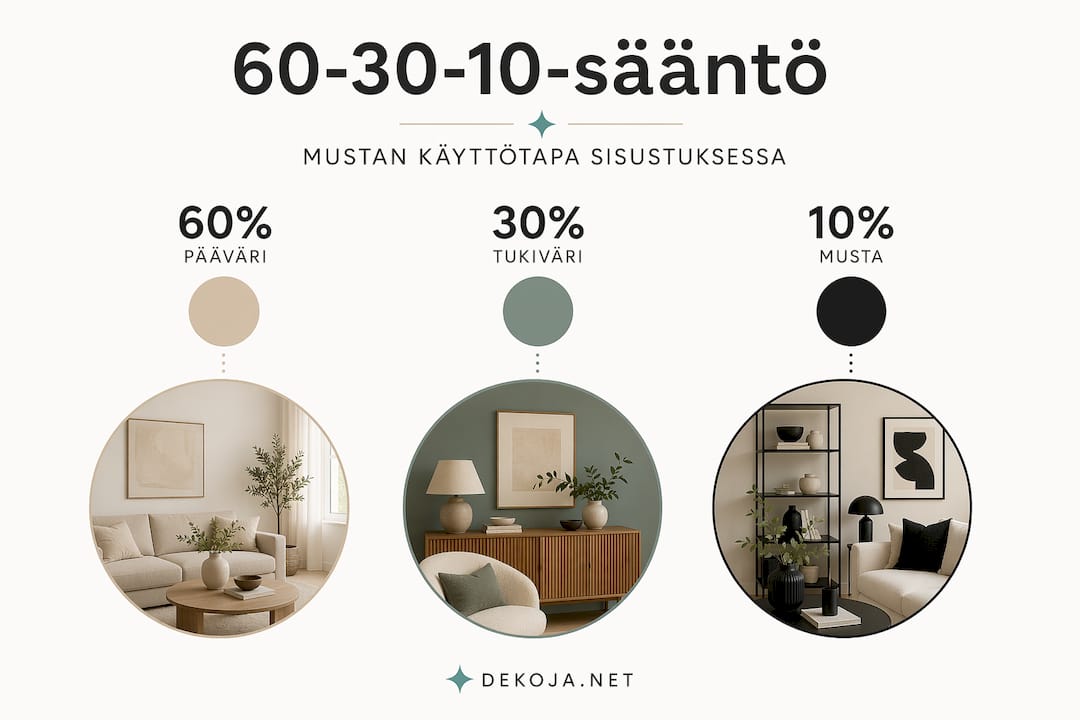
There's a classic guideline for using color in interior design called the 60-30-10 rule. This tool particularly helps in managing powerful colors like black so that the space doesn't become unbalanced.
The logic of the rule is as follows:
- 60% is the dominant color of the space, usually the walls or floor. This is the background color that sets the foundation.
- 30% is the secondary color, for example, furniture, curtains, or a rug. It complements the main color and adds variety.
- 10% is the accent color, which can be black. This proportion includes pillows, frames, lamp bases, chair legs, or small surface materials.
Adding black at 10 percent brings dignity and a sense of control without making the space feel heavy. This is the proportion where black shines best.
| Combination | Atmosphere | Best suited for |
|---|---|---|
| Black + butter yellow | Warm, inviting, elegantly casual | Living room, dining room |
| Black + white | Clear, modern, graphic | Office, bathroom |
| Black + grey | Subtle, professional, stylish | Restaurant, gallery |
| Black + dark green | Nature-inspired, deep, calming | Bedroom, library |
| Black + terracotta | Warm contrast, bold but earthy | Kitchen, living room |
The 60-30-10 rule is not absolute, but a guiding tool. A more experienced designer may consciously deviate from it, but it is a reliable starting point.
Professional tip: Butter yellow and black is one of the most effective combinations. Light warm shades soften the "harshness" of black, making the space inviting rather than rigid.
Practical Tips for Utilizing Black
Theory is useful, but concrete choices are what matter. These tips are compiled for situations where mistakes with black are most commonly made.
Where to start
Don't start with an entire black wall. Begin with smaller elements where black's psychological properties can emerge without risk. Black steel-framed shelves, lamp arms, mirror frames, or chair legs can be safely added to a space.
Once you're accustomed to black's effect in a small proportion, it's easier to assess whether you want to expand it. Visual contrast is one of the most effective ways to make a space interesting, and black is unparalleled in contrasts.
Light, material, and texture
Black is a different color in different materials. Black velvet fabric feels soft and inviting. Black glossy lacquer is cold and precise. Black concrete surface is raw aesthetic. These differences are not just aesthetic; they affect how a space is perceived emotionally.
- Matte surfaces: Soften the space, suitable for bedrooms and living rooms. Absorb light and make the space more calming.
- Glossy surfaces: Suitable for bathrooms and modern kitchens. Add drama, but reveal every fingerprint.
- Textured surfaces (wood, concrete, fabric): Bring warmth and humanity to black. An excellent choice for spaces where both elegance and comfort are desired.
The use of black also involves light management. In a room with little natural light, black requires artificial light to support it, so the space doesn't become lifeless. Spotlighting brings a black surface to life and makes it a dramatically strong element.
Common mistakes
Too much black is the most common problem. But an equally common mistake is the wrong complementary colors. Cold grey alongside black makes a space stark. Cold white can do the same. If you want black to feel inviting rather than distant, combine it with warm tones.
Another mistake is to forget the connection between black and culture, especially in spaces frequented by many different people. A restaurant or office where all surfaces are black can feel oppressive or unpleasant to some visitors without a clear reason. This doesn't mean black should be avoided. It means that the use of black should be compensated with warmth, light, and textures.
A third mistake is to underestimate how much dark colors in psychology affect the experience of a space over the long term. For a short visit, a black space feels exciting. Living or working in the same space for months can make it tiring if balance hasn't been considered.
My Perspective on the Power of Black
I've observed through countless projects how black either saves a space or dampens it. Most often, the difference isn't in how much black is used, but in whether the designer understands what black does to the surrounding light and other colors.
I often see situations where black is added to a space as a final step because it "looks good in pictures." That's the wrong starting point. Black should be part of the design's structure from the beginning, not a surface finish.
I am particularly interested in the extreme end of black. When a surface absorbs almost all light, it completely changes the nature of the space. This is not suitable for all spaces. But in the right place, used in the right way, it creates an unforgettable experience. I have seen galleries and restaurants where this solution has transformed the customer experience to an entirely different level.
You will best find your own balance with black by experimenting. Start small, see how the space reacts, and add thoughtfully. Black rewards the patient designer.
— Mikko
Put Black Surfaces into Practice with Dekoja's Selection
Dekoja specializes in precisely those situations where ordinary black paint isn't enough. If you want surfaces that absorb light in an exceptional way or create visual effects that other materials cannot replicate, Dekoja delivers them directly from its domestic warehouse. Musou Black and other super black effect surfaces are used by restaurants, galleries, architects, and AV professionals across Finland. Explore Dekoja's selection and find a solution for your project. An expert will help you through the project from start to finish. Delivery in 1 - 3 business days from Finland.
FAQ
What does the psychology of black mean in practice?
The psychology of black refers to how the color black affects human emotions, mood, and spatial perception. The effect is context-dependent and varies according to culture and individual experiences.
How much black is appropriate in interior design?
According to the 60-30-10 rule, black works best as an accent color, making up about 10 percent of the space. This is enough to add dignity without making the space feel heavy.
Why does black affect spatial perception so strongly?
Black absorbs or reflects light depending on the surface, which directly changes how the brain processes the size and atmosphere of a space. A matte surface creates depth, while a glossy surface adds drama.
What colors go well with black?
Butter yellow, terracotta, and warm white soften the effect of black. Cold grey or blue shades intensify black's aloofness and are not suitable for spaces where warmth is desired.
When should black be avoided in interior design?
Black should be kept to a small proportion in spaces with limited natural light or where people spend long periods, such as an office or bedroom, unless lighting and other colors compensate for its weight.