

The Role of Contrast in Restaurants: A Designer's Guide
In Brief:
- Contrast is a key tool for a restaurant's visual appearance and accessibility. It directs customer attention and creates depth and ambiance in the space.
Contrast is the most effective visual tool in restaurant interior design for creating depth, ambiance, and accessibility. Its role in restaurants goes far beyond the surface: it determines how a customer perceives the space at first glance, how safely they navigate it, and how strongly the restaurant makes an impression. Color, lighting, and material contrasts work together as building blocks of a brand's visual identity. In this guide, we will explore how a designer or owner can consciously and effectively utilize contrast.
What is the role of contrast in a restaurant's visual identity?
Contrast in a restaurant's visual identity refers to the juxtaposition of two or more different elements so that the difference between them is clearly discernible. This difference can arise from colors, materials, textures, lighting, or shapes. When contrast is consciously designed, it directs the viewer's attention to desired points and creates visual rhythm in the space.
Color contrasts are the most common way to build spatial depth. A dark back wall makes light furniture appear airy and distant, increasing the perceived size of the space. Texture contrast, such as the combination of a rough concrete surface and shiny metal, adds layering to the space without changing colors.
Lighting contrasts are the essence of ambiance creation. Warm lighting at 2700K–3000K makes food more appealing and creates a comfortable atmosphere. Too uniform or bright lighting completely removes contrast and makes the space clinical. Spotlighting individual tables or artworks creates focal points that naturally draw the eye.
Visual contrast is also a building block of brand identity, not merely an aesthetic choice. The combination of matte black and golden yellow metal creates a striking contrast that functions both as a creator of space ambiance and as a visual signature of the brand.
- Color Contrast: Dark and light side-by-side create depth and guide the eye.
- Texture Contrast: Rough and smooth surfaces in the same space add layering.
- Lighting Contrast: Spotlights and a dim background emphasize desired elements.
- Material Contrast: Wood, metal, and glass combined build visual diversity.
- Shape Contrast: Round and angular shapes in the same space create tension.
Professional tip: Start contrast planning from one anchor point, such as the bar counter or entrance. Build other contrasts around this point to maintain a cohesive yet visually interesting space.
How does contrast support accessibility in restaurant spaces?
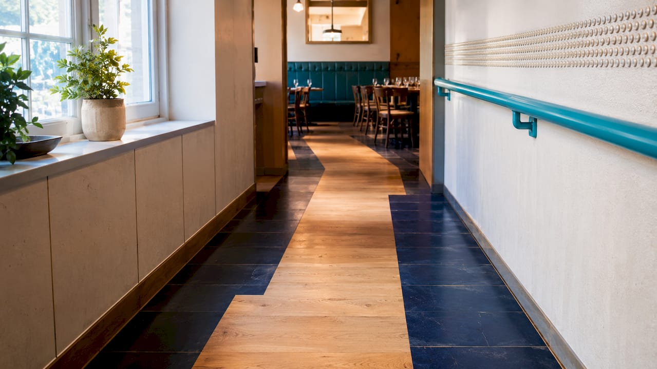
Accessibility is the most practical application of contrast in restaurant spaces. Visual contrast helps visually impaired customers perceive the structure of the space, pathways, and obstacles safely. A designer who ignores accessibility takes both a legal and ethical risk.
Minimum lighting requirements are clear. Pathways require at least 200 lux, and the same level applies to restrooms. The recommended level for cash registers is 300 lux. These figures are not recommendations but starting points for accessibility design.
Color contrasts on pathways are as important as lighting. In accessible restaurants, color contrasts are used to mark obstacles and pathways, and the maximum slope of ramps is 5%. A clear color contrast between the floor and wall helps define the boundaries of the space. Marking stair edges with contrasting colors is a simple measure that significantly reduces the risk of accidents.
The most common mistakes in accessibility design are:
- Leaving shadow areas: Shadow areas conceal stairs and obstacles. Layered lighting is a solution that eliminates hazardous contrast differences.
- Too weak floor-to-wall contrast: A uniform color scheme looks stylish but makes it difficult to perceive the space.
- Dazzling spotlights: Too strong a spotlight creates distracting shadows and impairs vision.
- Lack of contrast in digital menus: In digital menus, contrast between text and background and sufficient font size are basic prerequisites for readability.
Professional tip: Test the accessibility of the space by closing your eyes for a moment and then opening them again. If the pathway is not immediately discernible, the contrast is too weak.
At least 5% of customer seating must be accessible. This requirement also applies to visual design: accessible seating should be clearly marked with contrasting colors without detracting from the overall interior.
How do contrasts in flavors and spaces enrich the restaurant experience?
Contrasts in flavors and spaces operate on the same principle: difference creates an experience. Restaurant professionals see spatial contrasts, alongside flavor contrasts, as a factor that enhances the experiential aspect. When a dish combines crispy and soft, sour and sweet, tension arises. The same tension arises in a space where rough concrete meets a soft leather bench.
This similarity is no accident. Both are based on activating the senses through contrast. A designer who understands this connection can create a space that visually supports the dining experience.
Practical examples of contrast combinations:
- Dark ceiling, light floor: Creates an atmosphere where the space feels lower and more intimate. Suitable for fine dining concepts.
- Raw wooden table, black-painted wall: The combination emphasizes the warmth of natural materials and creates a dramatic backdrop.
- Open kitchen, closed dining room: A spatial contrast where noise and activity meet silence and peace.
- Bright detail, neutral base: A single colorful element, like a red artwork on a gray wall, is enough to create a lasting impression.
A successful restaurant concept uses visual contrast to differentiate itself and pique customer interest. Behind a restaurant awarded as Restaurant of the Year, there is often visual surprisingness that sets it apart from competitors. This doesn't mean everything has to be dramatic. Contrast can be subtle: a matte surface next to a glossy one, or warm light on a cold material.
Interior design solutions that support the dining experience are often those that mirror the menu's philosophy. Scandinavian minimalism suits a restaurant with clean flavors. Bold color contrasts suit a restaurant offering intense flavor combinations. The visual language of the space and the food speak the same language when the design is deliberate.
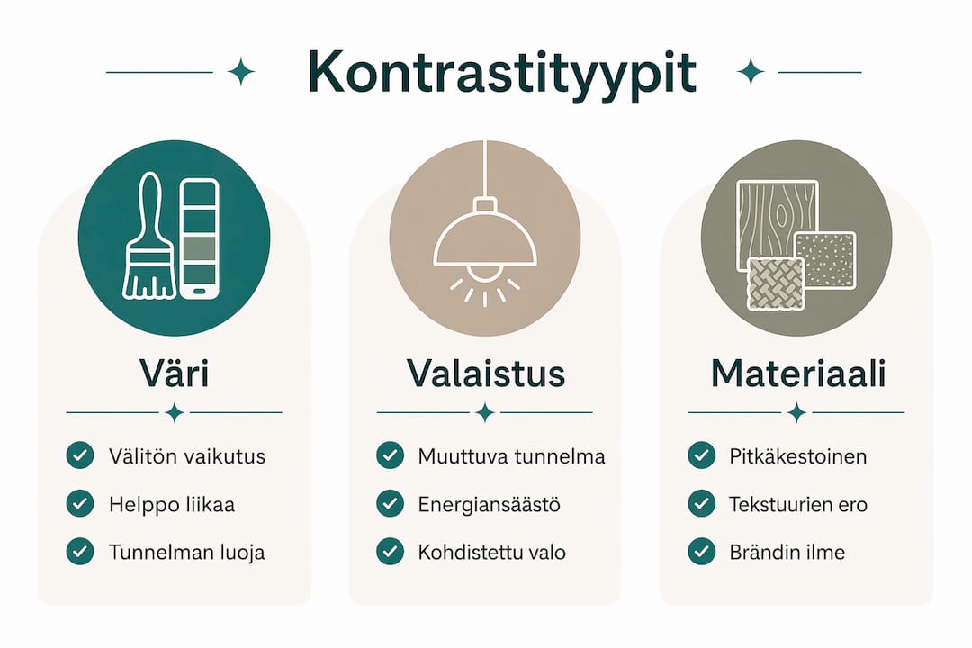
Comparison of different contrast types: color, lighting, and material
The three key types of contrast are color, lighting, and material contrast. Each has its own purpose and challenges.
| Contrast Type | Strengths | Challenges | Best Application |
|---|---|---|---|
| Color Contrast | Immediate visual impact, easy to implement | Can feel heavy if too many colors are used | Highlighting brand, marking pathways |
| Lighting Contrast | Adjustable according to ambiance, dynamic | Requires professional design, maintenance | Creating ambiance, highlighting food |
| Material Contrast | Durable, three-dimensional effect | More expensive to implement, requires material knowledge | Communicating quality, textural layers |
Color contrast is the quickest way to change the ambiance of a space. It's also the easiest mistake to make: too many colors or too strong a contrast makes the space restless. A designer can avoid this by choosing no more than three main colors and building contrast between them.
Lighting contrast is the most flexible tool. The same space can feel completely different between brunch and dinner when the intensity and direction of lighting are changed. The use of light and shadow builds depth and ambiance in ways that color alone cannot achieve.
Material contrast is the most long-lasting investment. Black and gold create a strong contrast that functions both as a brand accentuator and a creator of space ambiance. This combination communicates quality and thoughtful design. Material contrast does not age as quickly as trendy colors.
The intensity of contrast directly affects the customer experience. High contrast is suitable for restaurants that want to create a dramatic and memorable impression. Low contrast is suitable for quiet, intimate spaces where the customer wants to relax. The best result is achieved when the contrast intensity matches the restaurant's concept and target audience.
Key takeaways
Contrast is the single most important tool in restaurant visual design, simultaneously affecting atmosphere, accessibility, and brand distinctiveness.
| Point | Details |
|---|---|
| Minimum lighting level | At least 200 lux in pathways, 300 lux at cash registers to ensure accessibility. |
| Color contrast in accessibility | Pathways and obstacles are marked with color contrasts; the floor-to-wall boundary should be clearly discernible. |
| Material contrast as a brand | Black and gold, and other strong material pairings, convey quality and are memorable. |
| Connection between flavors and space | The visual contrast of the space supports the dining experience when it mirrors the menu's philosophy. |
| Contrast intensity | High contrast suits dramatic concepts, low contrast suits intimate fine dining spaces. |
Contrast design is more than aesthetics
I've followed restaurant interior design projects for years, and one thing recurs: designers underestimate the functional role of contrast. They think of it as a visual addition to be done when the budget runs out. In reality, contrast is the framework of the design, not a decoration.
I've seen restaurants where everything is technically correct: good materials, functional layout, quality lighting. Yet the space feels bland. The reason is almost always the same: there's no contrast. Everything is on the same level, in the same tone, with the same intensity. The eye has nothing to latch onto.
The best contrast I've seen in practice is one that feels obvious in hindsight. The customer can't say why the space feels good. They just know they want to come back. This is a sign of successful contrast design: it works invisibly.
A common mistake is also that contrast is designed for only one sense. Colors are carefully considered, but textures are forgotten. Lighting is planned, but the soundscape is left to chance. The best restaurant interior design activates multiple senses simultaneously, and contrast is the mechanism that makes it possible.
I always recommend starting with one question: what do I want the customer to feel when they walk in? The answer guides the intensity of the contrast, the choice of colors, and materials. Without this question, contrast is just random.
— Mikko
Dekoja helps build contrast that stands out
A restaurant's visual identity needs materials that make contrast concrete. Dekoja supplies super black effect surfaces, Musou Black paint, and non-reflective materials from Finland, creating a contrast that cannot be overlooked.
Dekoja serves restaurants, interior designers, and architects in projects where ordinary black is not enough. Black surface materials in a restaurant's visual appearance are a specialty that Dekoja has mastered. Deliveries from domestic warehouse are dispatched in 1–3 business days. B2B service covers project-specific consultation from start to finish. Contact us and tell us about your project.
Frequently Asked Questions
What is the significance of contrast in a restaurant's ambiance?
Contrast determines how a customer perceives the space visually and emotionally. Without contrast, the space feels bland and is poorly remembered.
How much light is needed in pathways?
Pathways require at least 200 lux, and cash registers 300 lux. These levels ensure both safety and accessibility.
How does color contrast support accessibility?
Color contrast clearly marks pathways, obstacles, and spatial boundaries. This particularly helps visually impaired customers navigate safely.
Which type of contrast is suitable for a fine dining restaurant?
Low, deliberate contrast, such as dark material with warm spotlights, suits an intimate fine dining atmosphere. Dramatic color contrasts are better suited for casual dining concepts.
How does flavor contrast relate to space design?
Contrasts in flavors and spaces operate on the same principle: difference creates an experience. The visual philosophy of the space should be built to mirror the flavor profile of the menu.