
The Color Theory of Black – Deep Contrast for Interior Design
The tension between light and shadow fascinates interior designers across Central Europe, as they aim to create visual contrast and control the mood of a space in restaurants and exhibitions. Black functions in interior design as a phenomenon in its own right, rather than simply as a color choice, offering depth and the ability to highlight both details and larger wholes. This article brings together the basic principles that will help the possibilities of black tones, surfaces and contrast become truly usable in the design of the future.
Table of contents
- Basic principles and concepts of black color theory
- Different shades and surface treatments of black in interior design
- Contrast effects and visuality in restaurant architecture
- Practical applications of Musou black and differences from traditional materials
- Risks and common mistakes when using dark surfaces
Key Considerations
| Paragraph | Detail |
|---|---|
| The meaning of black in color theory | Black is a complex color that affects the atmosphere and visual experience of a space, standing out from traditional color schemes. |
| The role of black tones and surface treatments | Different black tones and surface treatments (matte, glossy) create different moods, and combining them requires careful consideration. |
| Contrast effects in design | Contrasts between different elements, such as light and materials, are central to restaurant architecture, shaping the customer experience. |
| Risks of dark surfaces | The use of dark surfaces requires careful lighting and material choices to avoid an oppressive atmosphere and worn surfaces. |
Basic principles and concepts of black color theory
Black is not just a color, but a philosophical and aesthetic experience that challenges traditional concepts of color perception. In the historical development of color theory, black has functioned as a complex element that transcends the boundaries of conventional color theory.
Theoretical understanding of color requires a deep understanding of its physical and psychological properties. Black as a color represents absolute contrast and depth, where all wavelengths of light are absorbed. This makes black a unique color that evokes strong emotional reactions and visual experiences.
The basic properties of the color black can be divided into the following categories:
- Absorption : Complete light absorption
- Contrast : The sharpest visual interfaces
- Psychological effect : Depth, elegance, mystery
- Aesthetic meaning : Minimalism and limitlessness
Color scholars have long studied the role of black in visual experience. Modern color theory studies show that black is not simply the absence of color, but an active and complex visual element that shapes the perception and mood of a space.

Pro tip: Use black judiciously in your interior design – it can either deepen or flatten a space depending on the surrounding colors and lighting.
Different shades and surface treatments of black in interior design
The versatile use of black in interior design offers designers unlimited creative possibilities. Black is not just a color, but a complex visual element that can radically change the mood and proportions of a space.
The different finishes of black can be roughly divided into two main categories: matte and glossy black. Matte black creates a calm, soft and deep atmosphere, while glossy black reflects light and adds a dramatic, elegant dimension to the space.
Different shades of black and surface properties:
- Carbon Black : Fully absorbent, intense shade
- Graphite black : Metallic, slightly shiny
- Anthracite : A deep, warm shade with hints of gray
- Black velvet : Soft, velvety surface texture
- Black chrome : Shiny, metallic finish
Combining shades of black requires careful consideration. Gold, copper or silver elements bring warmth and depth to black, creating a harmonious whole.
Below we compare the uses of different black shades and surfaces in interior design:
| Black shade/surface | Best suited | Atmosphere in the room |
|---|---|---|
| Carbon black | Minimalist spaces | Powerful and clear |
| Graphite black | Modern kitchen, office | Cool and technical |
| Anthracite | Living room, home office | Warm and inviting |
| Black velvet | Bedroom, lounge area | Soft and luxurious |
| Black chrome | Bathroom, details | Elegant splendor |
Pro tip: Try layering different shades of black – combine matte and glossy surfaces to create a multi-dimensional and dynamic interior design.
Contrast effects and visuality in restaurant architecture
The visual development of restaurant architecture is a multidimensional artistic process, where contrast acts as a key design element. Contrast effects are not just aesthetic solutions, but strategic tools that shape the customer experience and the emotional dimension of the space.
The basic elements of visual contrast in restaurant spaces can be divided into the following categories:
- Light contrast : Strong differences in lighting
- Contrast of materials : Glossy and matte surfaces
- Color contrast : Dark and light tones
- Geometric contrast : Straight and curved shapes
- Texture contrast : Rough and smooth surfaces
Historically, contrasting effects have been a significant means of creating unique spatial experiences in restaurant architecture . Modern designers are utilizing these techniques in an ever more innovative way, combining different visual elements to create striking and memorable spaces.
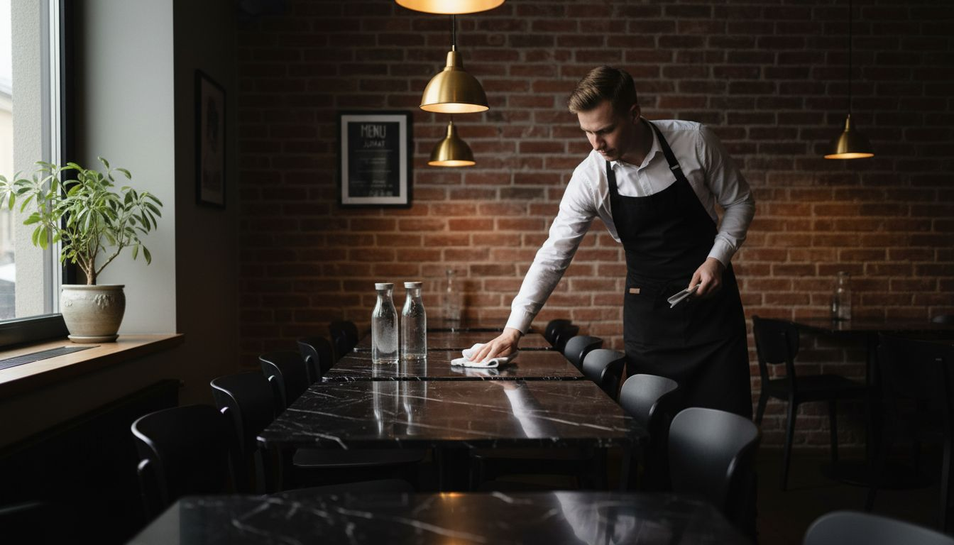
Pro tip: Use black to create contrast – it works great as both a background color and as a detail highlighter in restaurant space design.
Practical applications of Musou Black and differences from traditional materials
The diversity of Musou Black materials goes beyond traditional interior materials, offering unique technical properties. It is not just a color, but a complex solution that completely transforms the visual experience of a space.
The material properties of Musou Black differ significantly from traditional surface materials:
- Light absorption : Up to 99.4% of visible light is absorbed
- Surface texture : Available in foam boards, fabrics and acrylic paint
- Safety : REACH and RoHS certified
- Versatility : Suitable for theaters, art installations, exhibition spaces
- Contrast Control : Create extremely sharp visual interfaces
Compared to traditional black materials, Musou Black offers a completely new approach to visual expression. Where ordinary black surfaces reflect light, Musou Black absorbs it, creating depth and contrast that were previously unattainable.
Pro tip: Test Musou Black materials before large-scale use – every space and lighting works differently.
Risks and common mistakes when using dark surfaces
The challenges of using dark surfaces in interior design require careful planning and an understanding of visual effects. The wrong choices can change the mood of a space completely opposite to what was intended.
The most common mistakes when using dark surfaces can be divided into the following categories:
- Lighting errors : Insufficient or incorrect lighting
- Aspect ratio control : Too wide dark area
- Material choices : Poor surface treatments
- Lack of contrast : One-sided color scheme
- Texture management : Monotonic use of surface textures
The technical implementation of surface treatment requires careful preliminary work and a detailed knowledge of the materials. Incorrect surface treatment can lead to quickly worn and uneven surfaces that lose their original aesthetic value.
Here is a summary of the typical risks of dark surfaces and how to prevent them:
| Risk | Effect on interior design | Contraception |
|---|---|---|
| Too dark overall | An ominous, dark atmosphere | Adequate lighting |
| Poor choice of materials | Surfaces wear out quickly | Durable surface treatment |
| Lack of contrast | Monotonous overall appearance | Combine light details |
| Uneven lighting | Shadows are too emphasized | Balanced light sources |
Pro tip: Always test dark shades in a small area and under different lighting conditions before using them on a large scale.
Experience deep contrast and a new kind of visual space with the black color theory
A deep understanding of the color theory of black reveals its importance in creating mood and contrast in a space. Often the challenge is finding a material or color that effectively absorbs light while capturing the viewer's attention. This is where Musou Black offers a solution that goes beyond ordinary matte surfaces to create an exceptionally deep and dramatic spatial experience.
With Musou Black you can take the finishing touch of your interior to a new level, whether it's a restaurant, art installations or home theater. We have versatile interior solutions for every need, which perfectly match the different shades and contrasting effects of black. Explore our selection and find materials that will make your space unforgettable Interior design - home and office interior design products from us, check it out! – Dekoja.net
Don't let the dark tones of your interior be overshadowed, but take advantage of a solution that combines technology and aesthetics. Visit https://dekoja.net and take the first step towards spaces that speak to you and immediately catch your eye. Also check out our new products that meet today's most demanding visual needs new-collection – Dekoja.net
Frequently asked questions
What is the role of black in interior design?
Black is not just a color, it acts as a powerful visual element that can change the mood and proportions of a space. It creates depth and contrast, making it an important part of modern interior design.
How do different shades of black differ from each other in interior design?
Different shades of black, such as carbon black, graphite black and anthracite, offer different visual and atmospheric effects. For example, carbon black is intense and powerful, while anthracite is warm and inviting.
What types of black surfaces can be used in interior design?
Black surfaces can be divided into matte and glossy black. Matte surfaces create a calm and soft atmosphere, while glossy surfaces reflect light and bring dramatic elegance.
What are common mistakes when using dark surfaces?
The most common mistakes when using dark surfaces are insufficient lighting, poor material choices, too large a dark area, and lack of contrast. It is important to ensure sufficient lighting and the suitability of the materials for the atmosphere of the space.