
Shades of black in design – The magic of depth and contrast
Many European design professionals are surprised to learn that a matte black surface can absorb up to 99.4 percent of light , creating a completely new spatial experience. From Germany to Italy, visual contrast has become a crucial factor in the design of restaurants and public spaces. In this article, you will learn about the basic concepts of black tones, the latest anti-reflective technology, and concrete solutions that will help you stand out in the European design market.
Contents
- Shades of black in design – basic concepts and myths
- Different types of black: matte, musou black and others
- Anti-reflection and light absorption in spatial design
- The use of black in restaurants and public spaces
- Practical differences, costs and most typical mistakes
Key considerations
| Attention | Detail |
|---|---|
| Black is a versatile color | Black has profound meanings and functions both as an independent element and as a contrast in design. |
| Different shades of black affect the atmosphere of the space | Matte black creates a calm depth, while glossy black adds dramatic contrast. |
| Light absorption shapes experience | Black surfaces can create feelings of depth and mystery, which requires careful lighting design. |
| Costs and error risks require attention | Choosing the wrong shade of black or poor contrast can lead to expensive repairs, so professional help is recommended. |
Shades of black in design – basic concepts and myths
Black is not just a color, but a complex visual element that carries deeper meanings than many realize. Philosophically, black is an achromatic hue that is created when a surface absorbs almost all light , making it an exceptional and multi-meaningful design element.
Culturally, black carries numerous symbolic connotations. It is often associated with seriousness, elegance, and depth. In art and design, black functions both as an independent element and as a strong contrast. Different eras and cultures have interpreted black in different ways, which speaks to its multidimensional nature .
The use of black in design requires careful consideration. It is not just a color, but a visual tool that can create depth, drama or minimalist elegance. The different shades of black – from velvety soft to deep matte – offer designers a wide range of expressive possibilities. Traditionally, black has been used to delimit space, but today it can also play a leading role in creating dramatic and stunning spatial experiences.
Pro tip: Use black wisely and recognize its power as a contrast – a few well-chosen black details can change the mood of an entire space.
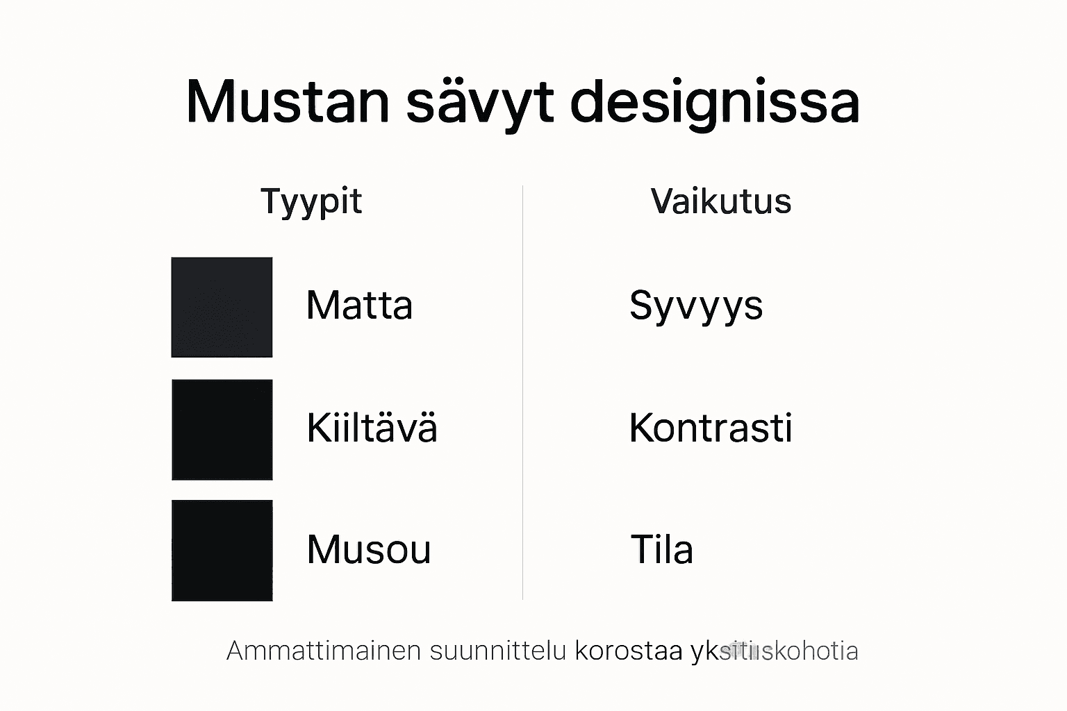
Different types of black: matte, Musou Black and others
Black has many manifestations in the design world, ranging from completely non-reflective surfaces to varying degrees of gloss. Technological advances have enabled the production of the deepest shades of black on the market, creating new possibilities in visual design .
In industrial and textile design, black shades are roughly divided into two categories: matte and glossy blacks . Matte blacks absorb light effectively and create a sense of depth without glare. Glossy blacks, on the other hand, reflect light, creating dramatic contrasts. In the textile industry, it has been studied that different binders significantly affect the creation and properties of black shades , which shows that there is no single black.
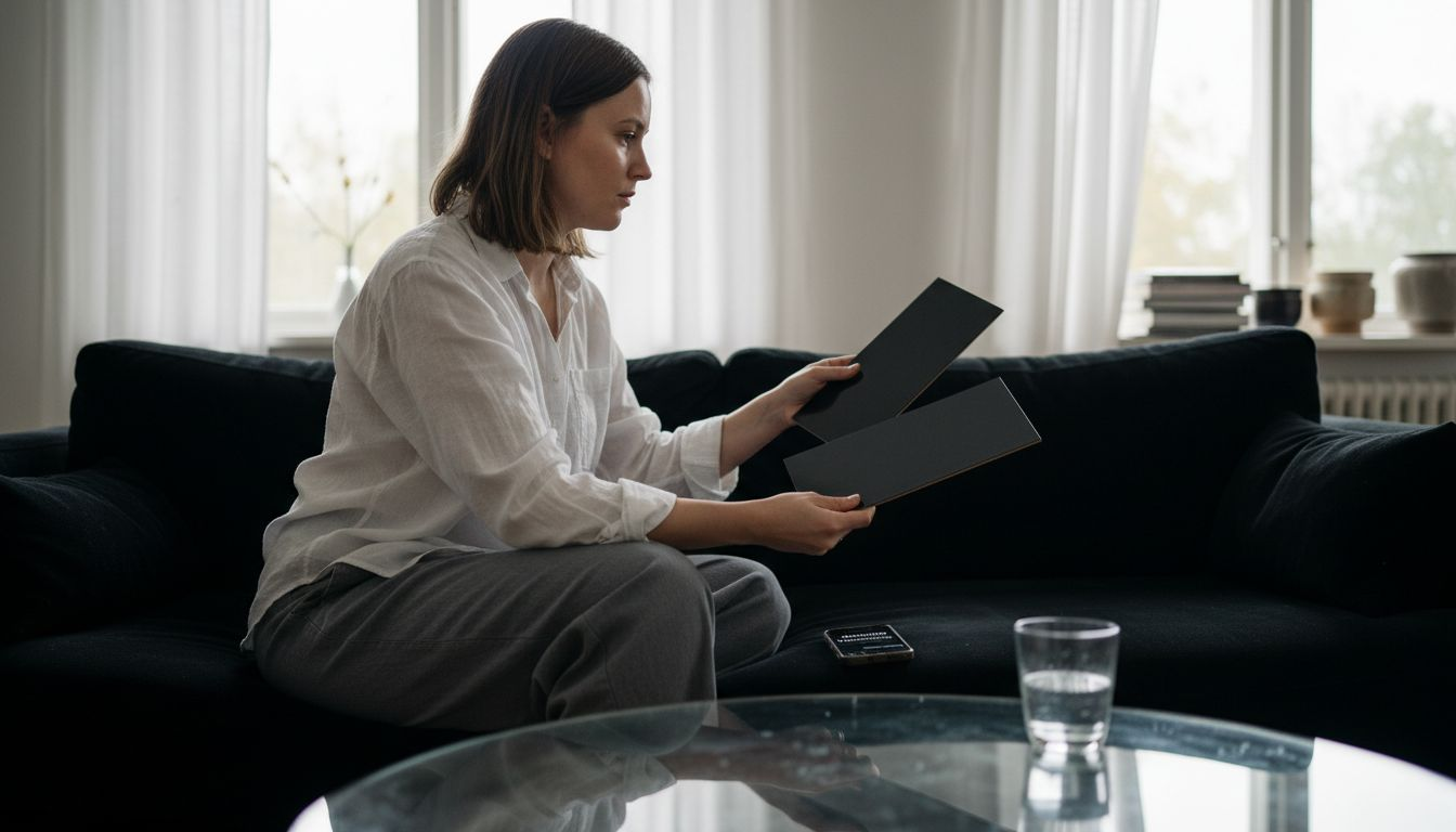
Special mention goes to Musou Black , which represents the ultimate black technology. This material absorbs up to 99.4% of light, making it virtually non-reflective. Where regular black acts as a boundary, Musou Black completely transforms the visual experience of a space, creating an incomprehensible sense of depth.
Pro tip: Always choose a shade of black based on the character and mood of the space – matte creates a calm depth, glossy creates a dramatic contrast.
Below is a comparison of the properties of different types of black in design:
| Black type | Light absorption | Visual impact | Suitability for space planning |
|---|---|---|---|
| Matte black | Very high | Soft depth, no glare | Peaceful and harmonious spaces |
| Glossy black | Moderate | Dramatic contrast | Accentuating and dynamic surfaces |
| Musou Black | Extremely high | Maximum depth | Attention-grabbing details |
| Semi-matte black | Medium level | Subdued contrast | Cool modern space solutions |
Anti-reflection and light absorption in spatial design
The non-reflectivity of a black surface is a complex visual phenomenon that completely changes the experience of space . When a surface absorbs almost all light, it creates a sense of depth that challenges our traditional understanding of the boundaries and proportions of space.
In spatial design, light absorption is a powerful visual tool. The importance of light and shadow is particularly emphasized with black surfaces, which guide the eye and create dramatic contrasts . Non-reflective black surfaces not only absorb light, but also shape the atmosphere of a space, creating an impression of depth and mystery.
In practice, managing non-reflectivity requires careful design. Black surfaces can be divided into two categories: completely non-reflective, which absorbs almost all light, and partially non-reflective, which creates softer contrasts. The combination of lighting, materials, and shades of black in a space determines the final visual experience.
Pro tip: Try different light sources alongside black surfaces – even a small change in lighting can create a completely new atmosphere in a space.
The use of black in restaurants and public spaces
The use of black in public spaces is a strategic way to create a monumental and carefully considered visual experience that challenges traditional notions of the atmosphere of a space. Restaurants and public spaces are ideal places to explore the multidimensional possibilities of the color black, as they require both aesthetic and functional design.
Black acts as both a boundary and a mood-maker in public spaces. It can make a space feel intimate and luxurious or create a dramatic contrast to other colors. Especially in restaurants, black can dramatically divide a space, create intimacy and direct the customer's gaze to desired areas. The use of black symbolizes historically and culturally strong meanings in different regions of Europe , which brings depth to the design of the space.
In practice, managing black in public spaces requires careful planning of lighting and contrast. A space that is too dark can feel oppressive, while when done right, black creates depth and mystery. In restaurants, this often means delineated black surfaces that act as accents and create atmospheric zones.
Pro tip: Use black judiciously in public spaces – a few well-placed black elements can change the mood of the entire space.
Practical differences, costs and most typical mistakes
The selection of black tones for interior paint materials is a complex process that requires careful consideration . Practical differences arise from the properties of the materials, lighting and the nature of the space, which directly affects the visual appearance and cost of the final result.
The costs of using black shades vary significantly. In graphic design, the optimization of printing inks and material choices largely determine the financial success of a project . The most common mistakes arise from careless design: choosing the wrong shade of black, insufficient contrast or neglecting surface preparation can lead to expensive repairs.
In practice, mastering the shades of black requires expertise. Black behaves differently in different materials – from paints to textiles. The lighting of the space, the material of the surfaces and the surrounding colors affect how black ultimately looks. Therefore, simply choosing a color is not enough, but a comprehensive understanding of visual design is needed.
Pro tip: Invest in a professional when designing your black tones – even a small mistake can cost you many times over in later repairs.
Here is a summary of the cost and error risks of designing in black:
| Planning area | Cost impact | Common mistake | Best practice |
|---|---|---|---|
| Paints and coatings | Significantly variable | Wrong tone in poor lighting | Test the shade in the lighting beforehand |
| Textiles | Reasonable | Uneven contrast | Choose by material |
| Graphic design | Small–moderate | Poor optimization of printing inks | Design for optimal CMYK values |
| Public spaces | High investment | Excessive black area causes darkness | Use black as an accent element |
The magic of depth and contrast in using black – take the next step in your design
Black tones in design challenge traditional spatial experiences and add mystery and depth to the space. If you want to create a unique atmosphere in a restaurant or other public space, you need maximum visual contrast and a nearly non-reflective surface. This is where Musou Black and other high-quality black materials come to the heart of the design.
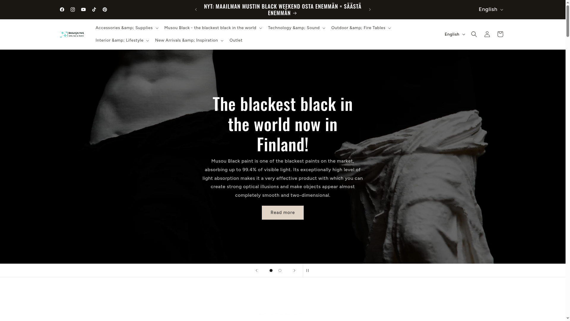
Discover Dekoja.net's selection that combines cutting-edge technology and aesthetic courage. You will find the world's blackest paint family, Musou Black, as well as other different shades of black and materials that are perfect for restaurants, exhibitions and home theaters. Design the lighting and surfaces of the space in collaboration with the materials and let the space tell its story with strong contrasts. Start today at Dekoja.net and also find Lamps and Lemus audio and electronics that complement the experience of your space.
Strengthen the visual impact of your space and stand out from the competition – reserve your solution now and let shades of black work their magic in your spaces.
Frequently asked questions
What is the significance of the color black in design?
Black acts as a powerful visual element that creates depth, contrast and elegance. It can act as a space delimiter or a spotlight, depending on its use.
What is the difference between matte and glossy black?
Matte black absorbs light, creating a calming depth without glare. Glossy black, on the other hand, reflects light, creating dramatic contrasts and a sense of depth.
What is Musou Black and why is it special?
Musou Black is an ultra-black material that absorbs up to 99.4% of light, making it virtually non-reflective, creating a unique visual experience of depth and space.
How should the color black be used in restaurants or public spaces?
Black should be used judiciously; it can divide the space towards the mood and direct the customer's eye. Proper lighting and contrast design are key to creating the atmosphere.
Recommendation
- Design Trend: Black Interior Design – Visual Power in Restaurants – Dekoja.net
- Design Trend: Black Interior Design – Visual Power in Restaurants – Dekoja.net
- Design Trend: Black Interior Design – Visual Power in Restaurants – Dekoja.net
- Why choose black paint – The deepest contrast for space design – Dekoja.net