
Black in space – contrast and the power of depth
Every restaurant interior designer in Central Europe quickly notices how ordinary materials limit the possibilities of a space’s appearance. Restaurants are increasingly competing to create the most memorable atmosphere for their customers. The bold use of black – especially with the innovative Musou Black, which absorbs up to 99.4 percent of light – completely changes the spatial experience and allows for a unique visual contrast that ordinary black cannot offer.
Table of contents
- What does black in space mean?
- Different shades and gloss levels of black
- The interaction of black and lighting
- Musou black: difference from normal black
- The drama and visual contrast of the restaurant space
- The most common mistakes when using black in space
Key information
| Paragraph | Purpose |
|---|---|
| Black in space creates atmosphere | Black acts as a significant element that adds intimacy and depth to a space. Its use requires careful lighting design. |
| The importance of gloss level | The gloss level of black has a major impact on the visual appearance and durability of the surface. Choosing the right gloss level can affect the aesthetics and usability of a space. |
| The interaction of light and black | Black absorbs light, so lighting needs to be strategic. Well-designed lighting enhances the atmosphere of a space and adds visual contrast. |
| Avoid excessive use of black | Black is not suitable as the dominant color of the entire space without balancing elements. Excessive use can create an oppressive atmosphere and weaken the customer experience. |
What does black in space mean?
Black in a space is more than just a color choice. It describes a space where black acts as the most central or dominant element in the interior design , forming the basis for the look and feel of the space. In a restaurant or a space being decorated, black is not a simple background color but a strategic design element that changes the entire spatial experience. It creates intimacy, elegance, and visual depth that light or traditional materials cannot match. Black should be seen as a tool that allows you to shape both the visual and emotional response of viewers to the space.
On a practical level, black in a space means choosing to use a dominant black color on walls, furniture, flooring, or selected elements. When integrated correctly, black doesn’t feel intimidating or cramped, but classy and elegant. This is possible because black is a neutral color that easily adapts to different styles and other color tones. You can combine black materials with white and light surfaces to create a dramatic contrast, or use different shades of black to create textures and depth. In restaurants and interior design, this means you can use black walls, backsplashes, decorative elements, and lighting accents without making the space feel closed or uncomfortable.
Black in a space also means controlling depth and graphic impression . When a black material absorbs light instead of reflecting it, the perspective and three-dimensionality of a space changes dramatically. The viewer's eye distinguishes black surfaces from their surroundings more clearly, which creates boundaries and contrasts in images. In restaurants and design spaces, this means in practice that lighting becomes more visible, interior elements stand out more clearly and the architecture of the entire space is emphasized. Black in a space is therefore not just a question of color, but also how the space reacts to light, how it guides the eye and how it creates an atmosphere that is memorable. When you pass the door of a restaurant or enter a curated design space where black dominates, it feels different from a regular space. It is black in a space.
Pro tip: Only choose a black space if you want the lighting to be the main feature of your space. Black absorbs light, so without proper lighting control, the space will feel dark and heavy. The light will become the main protagonist of your space, not the materials.
Different shades and gloss levels of black
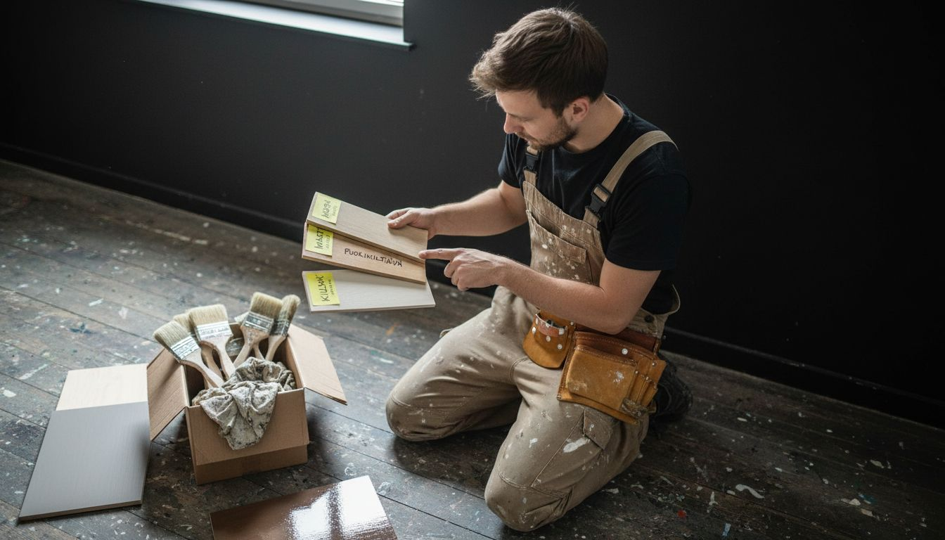
Black is not just black. When you start planning a black space for a restaurant or design space, you will quickly realize that black has different shades and especially different gloss levels that completely change how the color looks and feels. Gloss level, or the reflectivity of the surface, is a critical choice that affects not only the visual impression but also practical things such as maintaining cleanliness and the durability of the surface. In restaurants, where lighting and appearance are a source of competitive advantage, choosing the right gloss level can distinguish a sloppily designed space from a professionally executed spatial experience.
Black can be presented in six different gloss levels, each of which creates its own atmosphere and serves different purposes. Full-gloss black reflects light strongly and creates a modern, almost reflective surface that makes spaces look futuristic and cold. Glossy black offers a lot of reflection without being completely mirrored, suitable for modern restaurants that want to maintain elegance without too much light reflection. Then comes semi-gloss black , which balances between reflection and dullness. This is a versatile choice that works in most restaurants and interior design purposes.
Semi-matte and matte black are where the real drama and depth start to show. Semi-matte has a bit of reflection, but still has a flat surface that absorbs most of the light. Matte black is almost completely opaque, creating a sense of depth that matches the potential of black paint to create contrast . Finally, there is full matte black , which is the most extreme choice; it absorbs more light than a regular matte and creates an illusion of depth that can be stunning if used strategically.
The gloss level also affects practical aspects that cannot be ignored in a restaurant. Different gloss levels significantly affect the durability and cleanability of the surface . In a kitchen or bar, where the surface is subjected to constant stress and wiping, semi-matt or semi-gloss black is preferred, as these maintain the surface longer and are better able to withstand mechanical stress. Matt black is more delicate and requires more care, but it offers a visual advantage when working with the highest gloss. Full-gloss surfaces, on the other hand, show fingerprints and dust very clearly, which means more cleaning times per week in a restaurant environment.
In practical terms, you should choose a gloss level based on functionality and visual appeal. If you want maximum drama and depth and can tolerate regular cleaning, matte or semi-matte is best. If you are looking for a balance of beauty and practicality, semi-gloss or semi-matte will work for most restaurants. If a modern and futuristic look is your goal, gloss or full-gloss may be the solution, although they require more maintenance.
Pro tip: Test the gloss level on samples before making a final decision, as lighting has a significant impact on how different gloss levels look. The same semi-matte black can look completely different under cool white and warm yellow lighting.
The following table summarizes the strengths and weaknesses of different gloss levels of black in a restaurant environment:
| Gloss level | Visual impression | Surface durability | Manageability |
|---|---|---|---|
| Full gloss | Modern, futuristic | Most susceptible to scratches | Shows fingerprints quickly |
| Shiny | Elegant, bright | Quite durable | Clean frequently |
| Semi-gloss | Balanced, versatile | Resistant | Easy to maintain |
| Semi-matte | Deep, restrained | Very good | Easy to clean |
| Matt | Dramatic, dark | Sensitive to bumps | Dust is easily visible |
| Full matte | Maximum depth | Sensitive to wear | Requires regular care |
The interaction of black and lighting
Black and lighting are not separate design elements, but deeply intertwined. In lighting design, the color black poses a particular challenge because it significantly changes how light behaves in a space. When designing a black restaurant or interior space, you can’t think about the color black without simultaneously deciding how light will strike that surface. Black absorbs light, which means that most of the lighting is lost to the black surface instead of being reflected around the space. This is both a challenge and an opportunity. It’s a challenge because you need to understand that regular lighting doesn’t work the same way in light spaces. It’s an opportunity because you can use this property to create dramatic effects that other colors can’t.
The interaction of lighting with black works on three levels. The first level is luminosity and intensity . A black surface requires more light than a light surface to be seen properly. If you use the same lighting as in a traditional white restaurant, your black space will look too dark and uninviting. You need strategically placed, effective lighting that illuminates the black surfaces adequately but still maintains a dramatic atmosphere. The second level is creating contrast . When light hits a black surface and stays there, it breaks the rules and makes other elements appear brighter. White or light-colored interior elements inevitably stand out when surrounded by black. The third level is the perception of depth and space . Because black absorbs light, it makes spaces appear deeper and more three-dimensional. By lighting strategically, you can either reinforce this atmosphere or soften it.
In practice, this means you should think about lighting in parallel with your choice of black. Directional lighting is critical because it gives you control over which areas stand out and which are left in the background. In restaurants, directed light from the top of the ceiling or walls down creates a sense of volume and makes a black space dramatic without feeling intimidating. Background lighting , or ambient lighting, helps to create an overall mood. It can be soft, indirect light that immediately reflects off other materials, creating warmth. Spot lighting , or spotlighting, is a powerful tool when you want to highlight certain features or textures on a black surface. It can really bring the depth and texture of black to life in a way that flat, general lighting can’t.
Color also matters. White or cool blue lighting makes a black space look modern and clinical, suitable for a sophisticated bar environment. Warm yellow or orange lighting makes a black space feel intimate and inviting, suitable for a subdued restaurant dining environment. This is why many professional design spaces use adjustable lighting that can change the color temperature as needed. Finally, don’t forget that a black surface can be reflective or matte, and these require different lighting. Matte black absorbs almost all light, while semi-gloss or glossy black reflects some of the light, giving you more flexibility in lighting.
Pro tip: Test your lighting with a black surface before final installation. Use adjustable fixtures so you can experiment with different combinations of light intensity, direction, and color temperature. The same black surface looks completely different with 3000 Kelvin warm light versus 5000 Kelvin cool white light.
Musou Black: difference from normal black
When it comes to the color black in interior design, most people think of regular black paint or material. But Musou Black is a completely different category. It is not simply a darker version of regular black, but a fundamentally different material that works in a completely different way on a physical level. Musou Black absorbs up to 99.4 percent of light , making it significantly darker than regular black and visually completely different. For comparison: regular black paint reflects about 5 percent of light back. This small difference is huge. Regular black still looks black, but it has reflection, surface, texture. Musou Black looks almost like a portal to the afterlife, like a black hole that sucks light in.
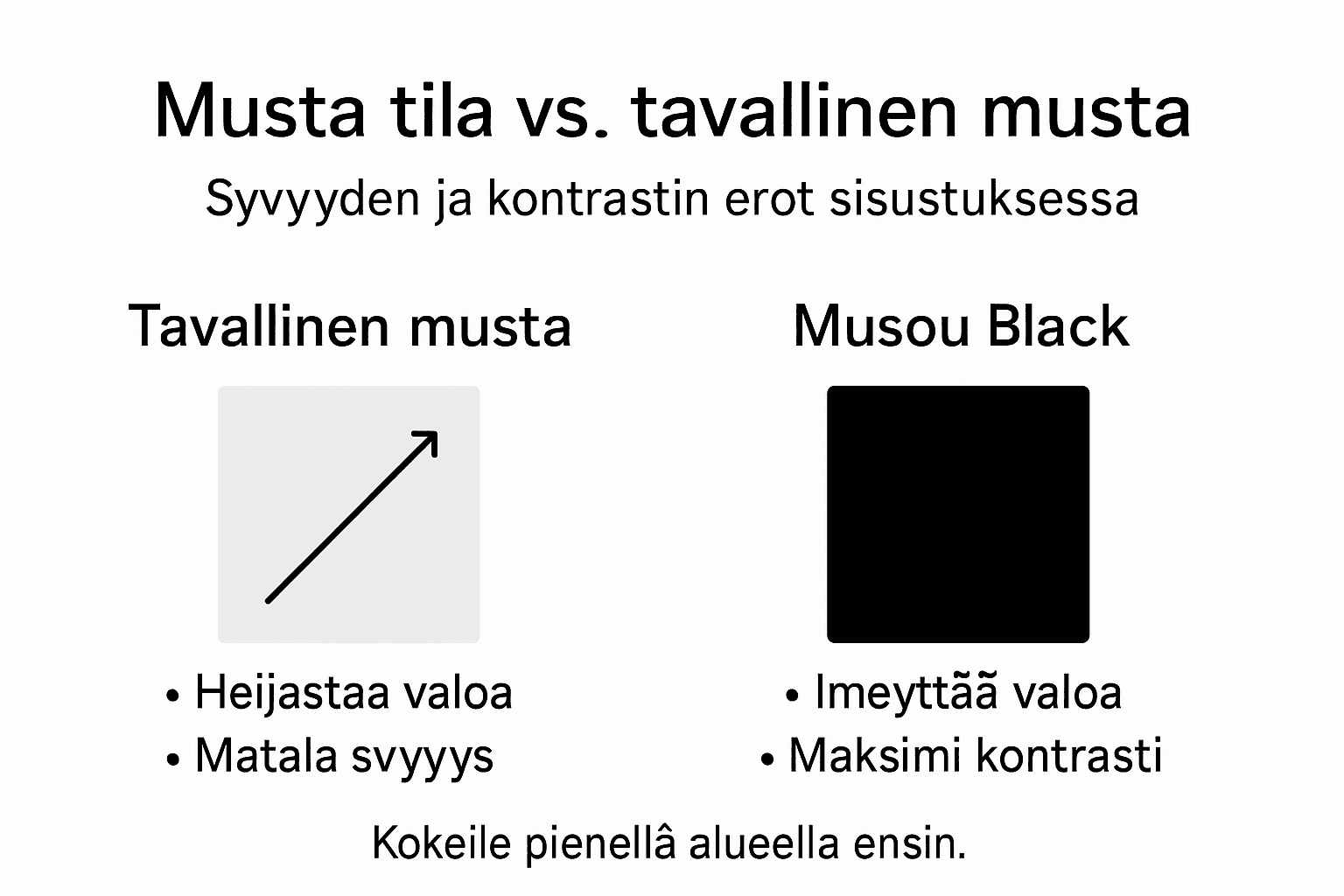
Understanding one key difference helps explain why Musou Black changes the experience of space better than regular black. The reflective nature of regular black means that lighting, if any, is reflected off the surface and distorts the surrounding space. This makes a regular black stack appear even further away, even if the color is dark. It’s like a game of lights, where the surface competes for light with the rest of the space. Musou Black, on the other hand, doesn’t compete at all. It accepts all light, making it appear absolutely black regardless of the lighting. This is why Musou Black creates a hypnotic, almost three-dimensional effect compared to regular black. It’s as if the surface is shallow or deep, and it’s not clear where it begins or ends.
On a practical level, this difference is noticeable in a restaurant and interior design environment. If you use a regular black paint on the background wall, you will still see the surface texture, reflections from the lighting and possibly small differences in color tones. The interior elements appear evenly lit, and the impression of depth is modern. When using Musou Black, the background wall practically disappears. It becomes part of the darkness of the background, and the only visible elements are those that collect or reflect light. This creates a dramatic contrast that makes white and light interior elements appear brighter and more three-dimensional. In a restaurant, this means that the lights in the bar, candles or other lighting effects stand out in a way that regular black can never match.
Musou Black also stands out in its texture and appearance. The matte, velvety appearance of Musou Black's surface makes it pleasing to the eye, even though it is an absolute black. Regular black paint can appear flat or even slightly shiny when viewed from a large surface. Musou Black always looks the same black and flat, no matter what angle you look at it from. This consistency is valuable in interior design, as it means the surface looks controlled and intentional, not just dark by accident.
If you compare the investment to regular black, you should understand that you are paying for the technology and the result. Regular black paint is cheaper, but Musou Black offers a visual power that other materials cannot deliver. In restaurants and premium interior environments, where ambiance and visual distinction are a competitive advantage, Musou Black pays for itself through its impact.
Pro tip : Test Musou Black on a small area before applying to an entire wall, as its extreme blackness may be more intense than expected. Also, remember that Musou Black requires particularly high-quality lighting design to avoid making the space appear dark or unpleasant.
The table below compares the practical and visual differences between Musou Black and regular black paint:
| Feature | Plain black paint | Musou Black |
|---|---|---|
| Light reflection | About 5% | Only 0.6% |
| Depth perception | Dark but superficial | Extreme, boundless blackness |
| Texture recognition | Seen in the light | The texture almost completely disappears |
| Use in interior design | Affordable and easy to use | Requires careful lighting and testing |
| Visual contrast | Clear but limited | Powerful, hypnotic effect |
The drama and visual contrast of the restaurant space
In a restaurant, the majority of the customer experience comes from the sense of sight. When a customer enters, they not only see the space but also sense the atmosphere created by the colors, materials, lighting and especially visual contrast . This contrast is what turns an ordinary restaurant into a memorable experience. The drama of a restaurant space is built on strong visual contrast, the shapes of the space and lighting , where the difference between dark and light surfaces creates depth and emphasizes the architecture and furnishings of the space significantly. When designing a black space for a restaurant, you cannot think of color in isolation. You have to think of contrast holistically, because it is from contrast that what people remember and feel is created.
Contrast works in three different ways in a restaurant space, each contributing to the overall effect. The first is color contrast , which is created between black and white surfaces. This is not as simple as a black wall and white furniture. It is strategic. If you use black as a background wall and white tables, the white tables will appear to be floating in the air. Customers will sit at these tables, and their attention will automatically be drawn to them. Contrast leads the attention to the desired objects. The second method is material contrast , which combines different textures. A black velvet or matte surface combined with shiny metallic elements or mirror-like surfaces creates a visually interesting surface. The third level is lighting contrast , where light wedges and shadows create depth. When strategically placed light hits a black surface, the light appears brighter and the interior elements stand out more than any other design element.
The drama is heightened by the use of targeted lighting and the use of material textures , creating an intense and engaging spatial experience. This is essential for restaurants that want to create a branded atmosphere and leave a lasting impression on the customer. Using an extremely black material like Musou Black takes this effect to the next level. It is not just a color, but a tool that allows you to control what the customer sees and where their eyes go. When the background walls absorb almost all the light, the only visible elements are those that are reflected. This means that the copper pipettes on the bar shine like jewels, the candles on the tables look softly warm, and the customers’ faces are visible in the lighting in a way that makes the space intimate and inviting.
A restaurant’s brand is strengthened by contrasts. If you want to create a bold, modern atmosphere, use black and white contrast with sharp lighting. If you want to create a luxurious, intimate atmosphere, use black and metallic accents and warm lighting. Contrast guides the customer experience and supports what you want to convey in your restaurant. Well-designed contrast in a space significantly improves the entire customer experience because it makes the space lively and dynamically interesting. The customer is not just eating food, they are part of a carefully crafted visual experience, every detail of which has been thought out.
Pro tip: Start with contrast by first thinking about which elements you want to highlight. Then choose dark surfaces around them that will make the accents more visible. Don’t fill the space with contrast everywhere, but use it strategically to draw customers’ attention to the right places.
The most common mistakes when using black in space
Black is a strong and impactful color, but because of its strength, its use requires consideration. Many interior designers and restaurateurs make the same mistakes when using black, and these mistakes can turn a space that is meant to be beautiful into one that feels oppressive or uncomfortable. The first and most common mistake is overusing black without balancing elements . When black dominates every wall, every piece of furniture, and every corner, the space begins to feel cluttered and oppressive. Customers won’t linger in such an environment for long, even if the lighting is perfect. Black doesn’t mean painting the entire space black. It means using black strategically to highlight specific areas and create depth. If you do use black, save for light and neutral surfaces where the eye can rest.
Another major mistake is related to lighting and its underestimation . The most common mistakes when using black in a space are often a lack of planning in the coordination of colors and light , in which case black can dominate the space too much and make it unpleasant or difficult to use. Black absorbs light, which means that regular lighting is not enough. If you have not allocated enough lighting for the black surface, the space will become too dark and unpleasant. Customers will not see faces with those sitting opposite them, interior elements will disappear, and the whole space will feel oppressive. Similarly, underestimating lighting with black can lead to a loss of contrast or the creation of a space that is too dark, which significantly reduces the functionality and comfort of the space. The third mistake is too sharp and unbalanced contrast . When you use black, contrasts automatically become sharper. If you do not manage this contrast carefully, the eyes will tire quickly and the space will begin to strain the viewer instead of inspiring.
On a practical level, the fourth mistake is cleaning and maintenance , which is often forgotten when choosing black. Black surfaces are often neglected, which quickly makes them look dirty and scratched . In a restaurant, where walls, furniture and interior elements are subjected to daily stress, a black surface will start to look untidy much faster than a light surface. Even the smallest grains of dust will show, fingerprints will shine through, and scratches or color variations will become visible. This is not only an aesthetic problem, but it creates the impression of unprofessionalism. If you choose black, you should also choose materials that are easy to clean and durable. The fifth mistake is a lack of overall planning . Black is not a color that you can add to a space on a whim. It requires careful planning that considers lighting, other materials, textures, their durability, and the overall goal of the space experience from the beginning.
Problems often arise from underestimating the power of black. Too much contrast without balancing elements can strain the eyes. Black is not a neutral color in a restaurant, but rather a leading element that defines the experience of the entire space. If you want to use black successfully, start in a small area. Test it on one wall or one quarter of the room, see how it affects the lighting and the overall atmosphere, and only then expand its use. Also, remember that different shades and gloss levels of black significantly affect the final result , so the choice is not a simple black or not black.
Professional advice Test black on small samples in different lighting before making a final decision, and make sure the lighting is OK before using black extensively. Choose materials to use with black based on their cleanability, not just aesthetic reasons.
Musou Black and Dekoja.net help create black space perfection
Designing a black space challenges the control of lighting and contrast. The article highlighted the importance of dramatic depth and visual contrast with black colors, as well as the necessity of using lighting correctly. Many people are looking for solutions that make a black space stylish, elegant, and at the same time functional under lighting. This is where Dekoja.net offers help with the Musou Black material. It absorbs up to 99.4 percent of the light, thus maximizing the dramatic contrast and depth of the space – something that is impossible to achieve with traditional black tones.
Now you have the opportunity to raise the visual level of your restaurant or interior to a new dimension. Discover Musou Black materials and our interior and lifestyle selection at Dekoja.net and find the right solutions for you that help control the lighting and the atmosphere of the space. Also see in more detail how Interior design and lifestyle – modern lamps, paintings and design products – Dekoja.net can complement your space with creative elements that emphasize the color black and make the space experiential and unique.
Frequently asked questions
What is the effect of black space in interior design?
Black space creates elegance, intimacy and visual depth, transforming the entire spatial experience. It works effectively as a contrast and mood creator.
How does lighting affect the successful use of black in a space?
Lighting is a key factor, as black absorbs light. Adequate and strategic lighting is essential to enliven the space and maintain the mood.
What are the gloss levels of black and their importance in interior design?
Black is available in different gloss levels, such as full gloss, glossy, semi-gloss, semi-matt, matt and full matt. The gloss level affects the visual impression, surface durability and maintenance requirements.
How can I avoid the most common mistakes when using black in space?
Avoid overusing black without balancing elements, underestimating the importance of lighting, and too much contrast. Plan carefully and experiment with different shades and gloss levels before making major changes.
Recommendation
- Deep black as a color – The power of visual contrast in spaces – Dekoja.net
- Deep black as a color – The power of visual contrast in spaces – Dekoja.net
- Deep black as a color – The power of visual contrast in spaces – Dekoja.net
- Deep black as a color – The power of visual contrast in spaces – Dekoja.net
- Blinds materials and colors - Tiimixi